# Project Management
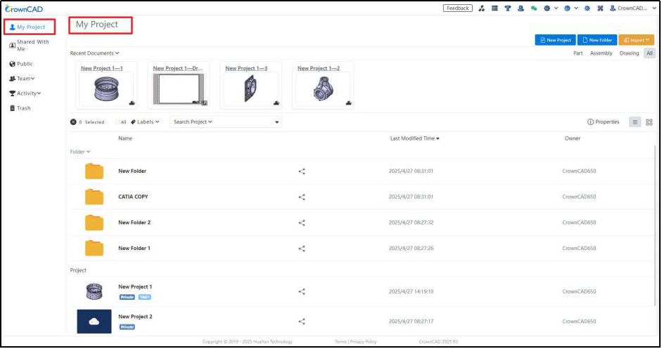
CrownCAD does not need to be installed. Open http://www.crowncad.com through a browser and log in to enter the project management interface Log in to the project interface.
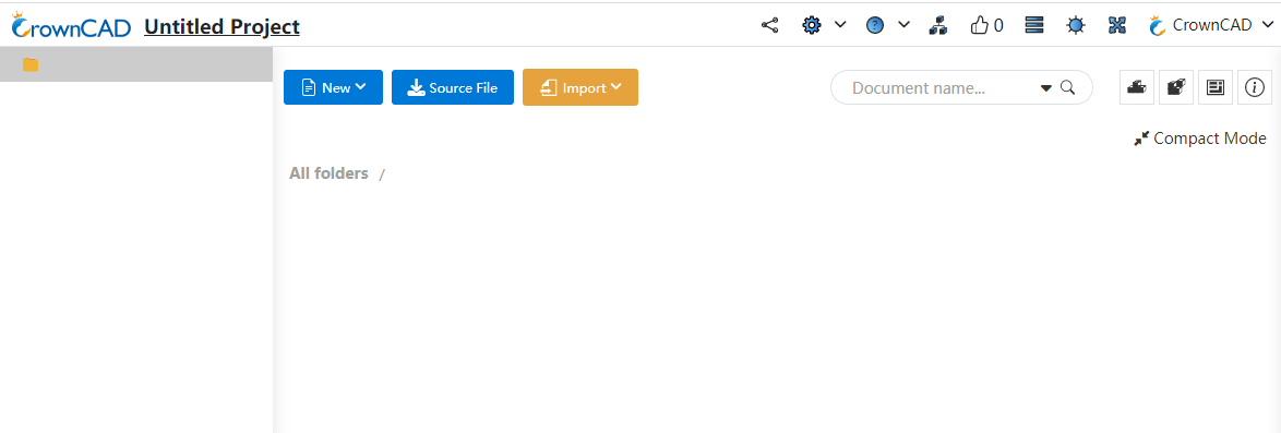
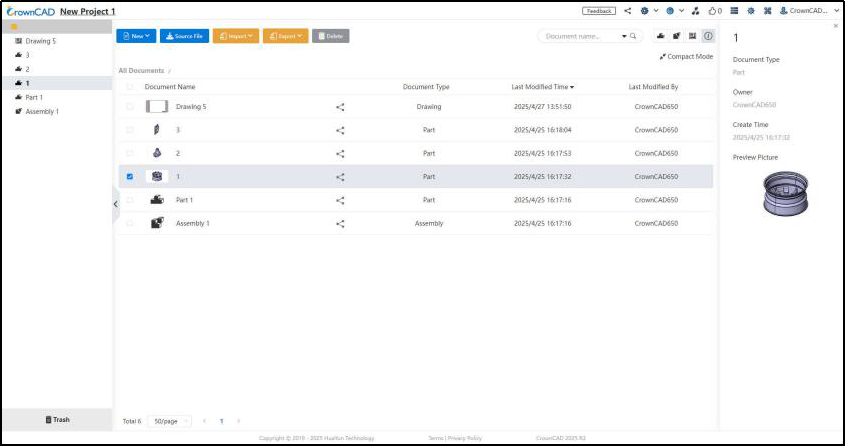
The following diagram shows the main elements of the CrownCAD project interface:
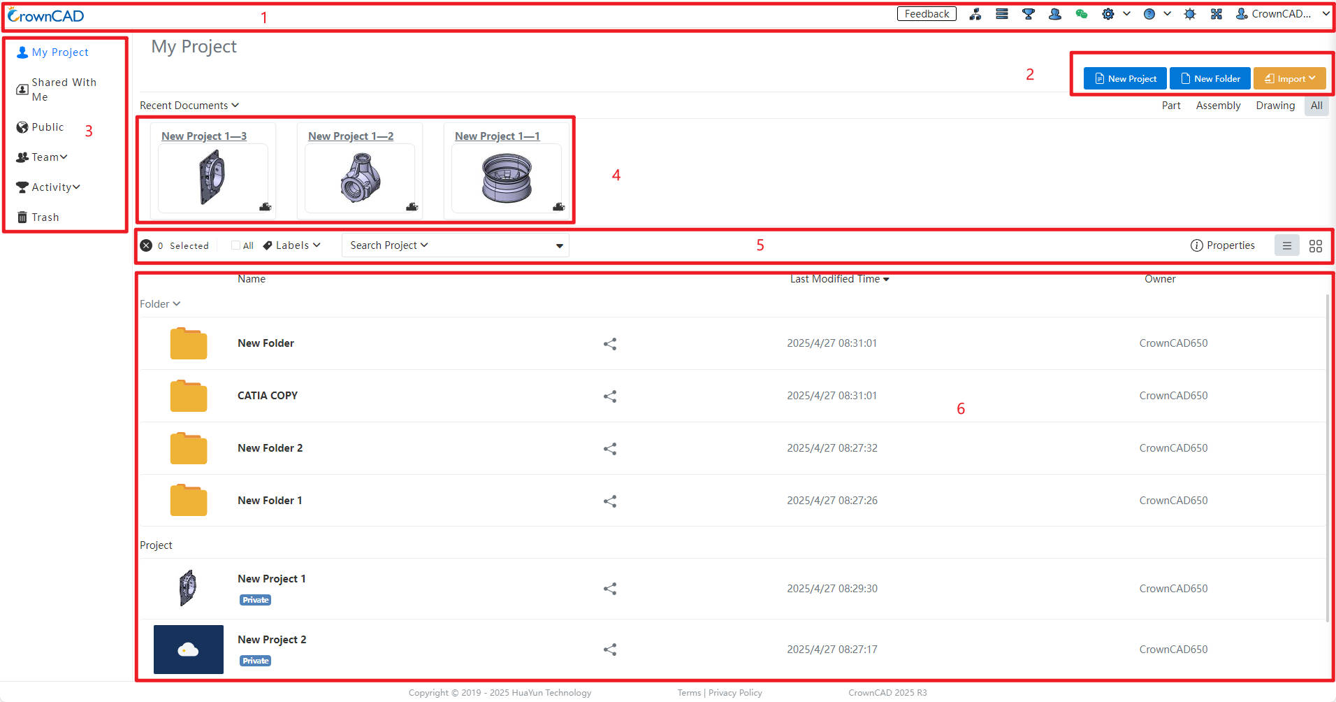
| 1 | 2 | 3 | 4 | 5 | 6 |
|---|---|---|---|---|---|
| Navigation bar | Create menu | Item type | Shortcut commands | Recent documents | List of items |
# Navigation Bar
The navigation bar includes Icon, Product Navigation,Task,Activity, Teams, Settings, Guide,User Information.
# Icon
Click in the upper-left corner of the browser window (anywhere in the user interface)  to return to the My Projects page.
# Feedback
Click  to jump to the feedback interface. After selecting the module to which the problem belongs, you can submit the issue.
# Product Navigation
Click  Product navigation to enter the product assembly navigation interface, which can quickly build the assembly BOM structure and create assembly items.
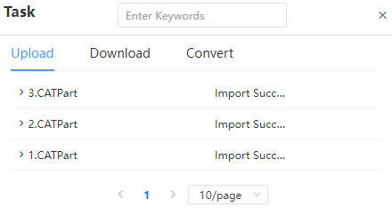
# Task
Click the task  to enter the task management interface. Display data exchange process, including upload, download, file conversion, and provide search function.
# Activity
Click the Activities  ,to enter the activity interface, as shown below.
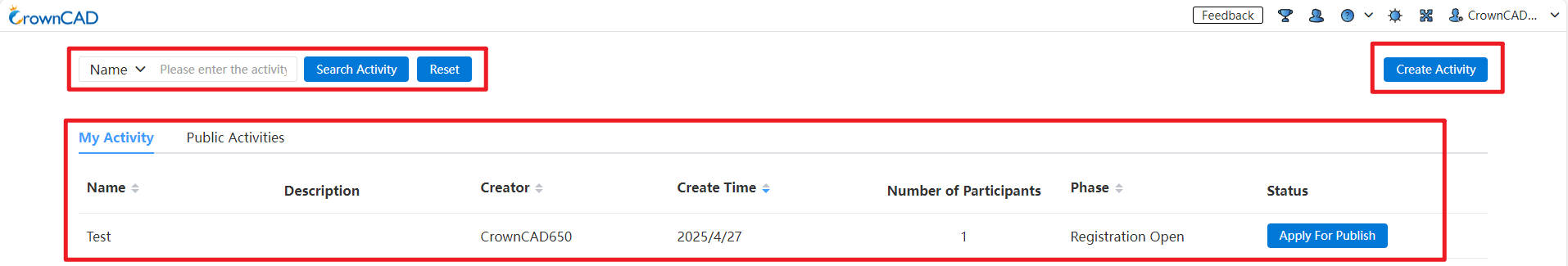
Search Activity:Enter the activity code to search, select, and join the activity.
My Activity:You can view the activities you have created or participated in .
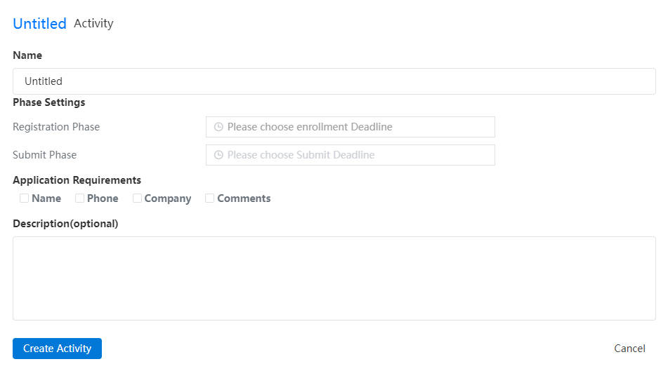
Create Activity:Click to pop up the activity interface, you can enter the activity details according to the options . After creating an event , the newly created event can be viewed in the 【My Activity】 list .
# Activity Management
The "Status" column in the "My Activity" list is used to display the activity status, including three states: application public button, review and public:
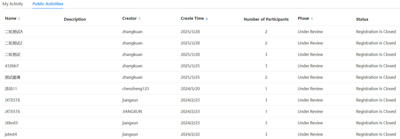
Note: After the activity application is made public, the status bar is displayed as "Under Review", and after the review is passed, the status is changed to "Public"; If the review is not passed, the status will be changed to the application public button;
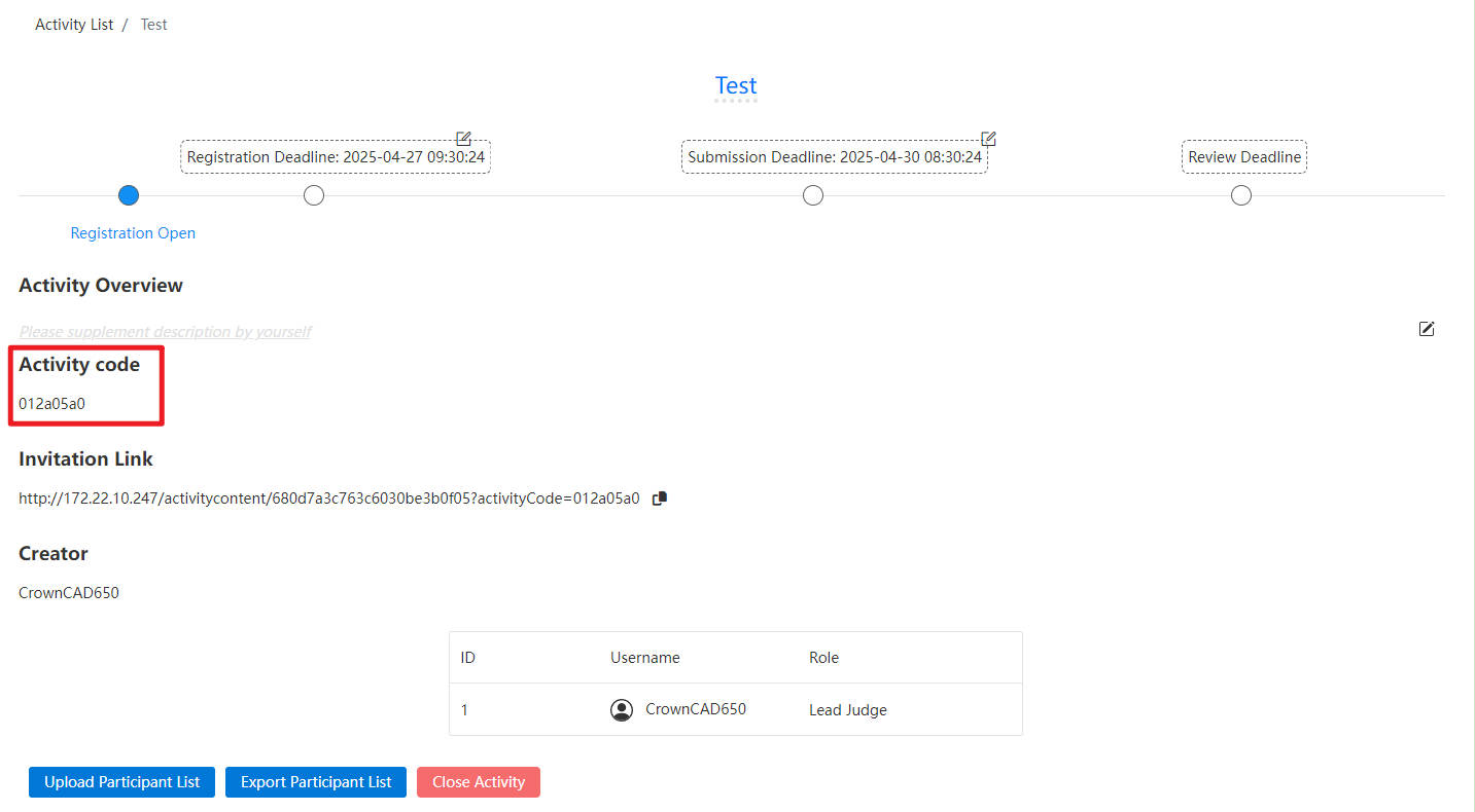
Activity list Click on an activity to open the activity details page. If you have joined the activity, you can see the activity code. If you have not joined the activity, the activity code will not be displayed on the details page.
# Create/Join Activity
Click【Create Activity】 after the pop-up activity interface, you can enter the activity details according to the options. After the creation is complete, the newly created activity will be displayed in the 【My Activity】 list and the status will be "Request Public".
The registration phase and submission phase are allowed to be on the same day, but the submission phase deadline must be after the registration phase deadline.
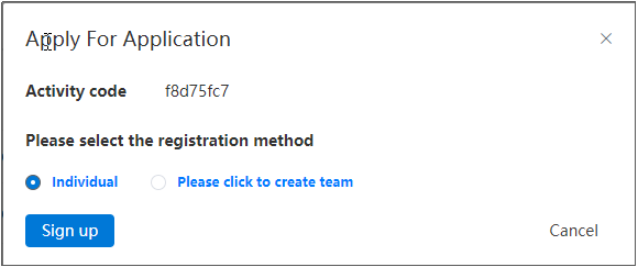
Join the activity:
Add the restriction of entering the activity code in the "Apply For Application" interface to prevent anyone from joining the activity, which may lead to the disclosure of activity information;
Entering the activity involves participation limitations to prevent a single user from competing in multiple formats.
Note:
Users can select either individual or team competition exclusively; both selections cannot be made simultaneously.
If a user is part of multiple teams, once any one of these teams has joined the activity, all other teams associated with this user will be prohibited from joining.
After User A has participated in the activity via team registration, they cannot re-enter the activity through alternative methods such as list importation.
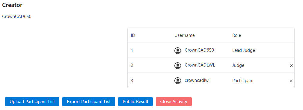
- For the permission management of activities, the roles of lead judge, judge and participant are divided, the creator of the activity is the main judge by default, and other roles are controlled by the main judge. Different roles have different permissions.
| Characters | Rules |
|---|---|
| Lead Judge | Activity creator master judge, has the highest authority, an activity only one master judge, and not transferable, you can view the name of the activity personnel (name shows the full name), support to change the rights of other roles, support to delete roles, support to publish results, support to end the activity.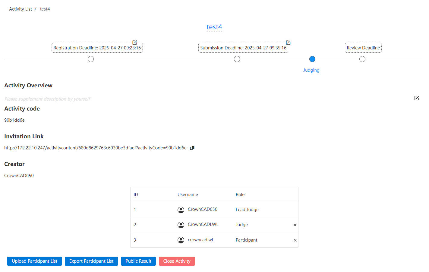 |
| Judge | Judges have the second authority, an activity can have more than one judge, set by the main judge, the judge can view the list of activity personnel (lead judge/judge/all participant show the full name), support deleting roles, support viewing results, support leaving the activity. |
| Participant | Participants have the lowest permission, one activity can have more than one participant, support to view the list of participants (lead judge/judge/I show the full name, other participants show the initial +***), support to view the results, support to leave the activity. |
- After the event review, support to upload and view the results of the competition, the Lead Judge click on the announcement results, open the upload dialog box, select the corresponding file to upload; Judges/Participants, click to view the results, download the corresponding file.
# Activity Project Management
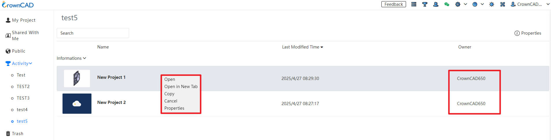
- In the active project list, the name of the project owner is displayed in different roles.
| Type | Name | Rules |
|---|---|---|
| Right-click menu | Copy | 1)All personnel in the activity can copy the project shared by the lead judge/judge, and the copied project will be displayed in my project (subsequent folder copy should be supported, the current product does not support folder copy, and it should be updated synchronously after subsequent addition); 2)The lead judge/judge of the project shared by the participant does not have the permission to copy. |
| List | Owner | 1)The lead judge can view the name of the project owner shared by any role; 2)The judges can see the project owner names shared by the lead judges/judges, and the owner names of all contestants are displayed as ***; 3)Participants can see the project owner shared by the lead judge/judge, and participants can only see their own works, can see their own owner name.(Synchronously adjust folders, project pages, document pages, and details) |
# Activity Review
View-only mode support model cutting view, including parts, assembly modules.
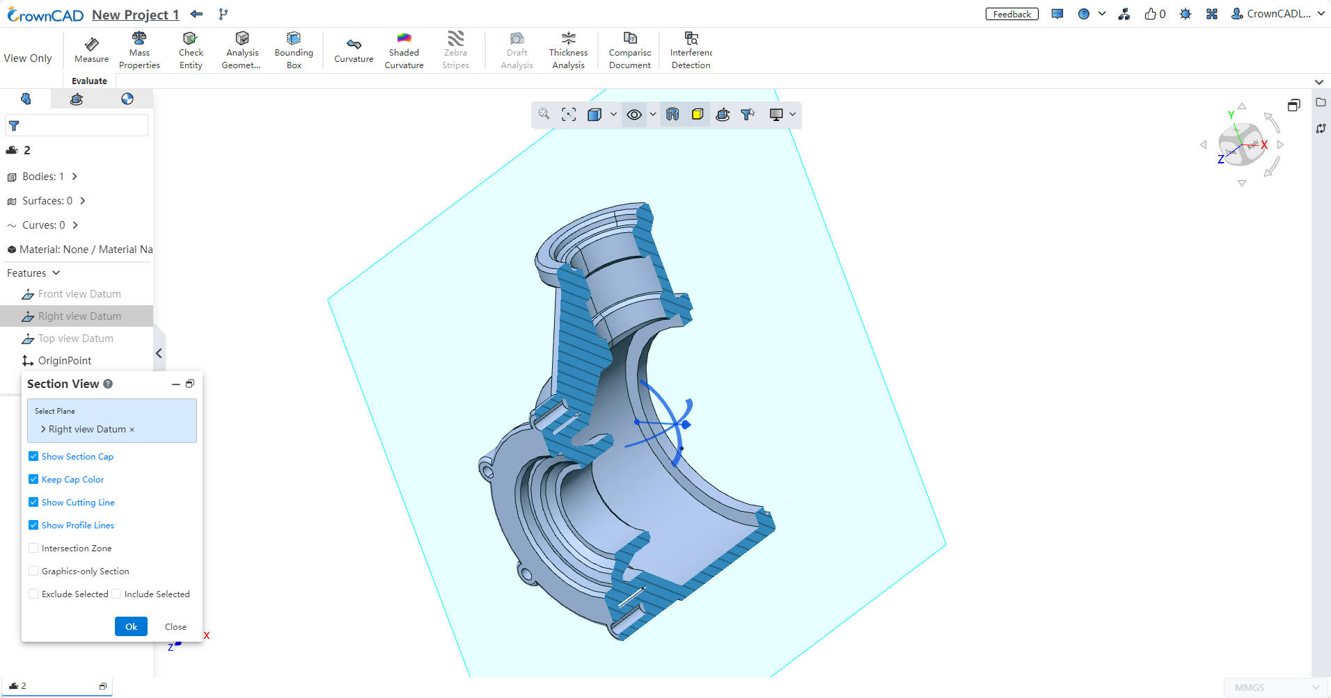
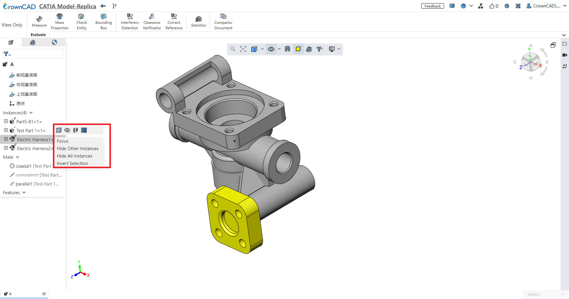
Assembly view-only mode, in the feature tree right-click list to add "Hide", "Hide All Instance", "Show All Instance", for the judge review to view the internal structure, refresh after the restoration.
# Submission of Works
Support submitting works in a folder format.
Note:
After sharing the folder to the activity, participants can still perform editing operations. However, upon manual submission or after the submission deadline, the folder will switch to archive mode, and all internal projects and documents within it will also transition to archive mode, making them uneditable.
After submitting the folder, clicking on the top-left project name in individual/team projects no longer displays the project settings popup. For team creators, right-clicking on internal projects does not display a command related to project permissions in the options.
# Teams
Click 【Teams】 to enter the team interface, as shown below.
Note:
This feature is available in Pro and above.
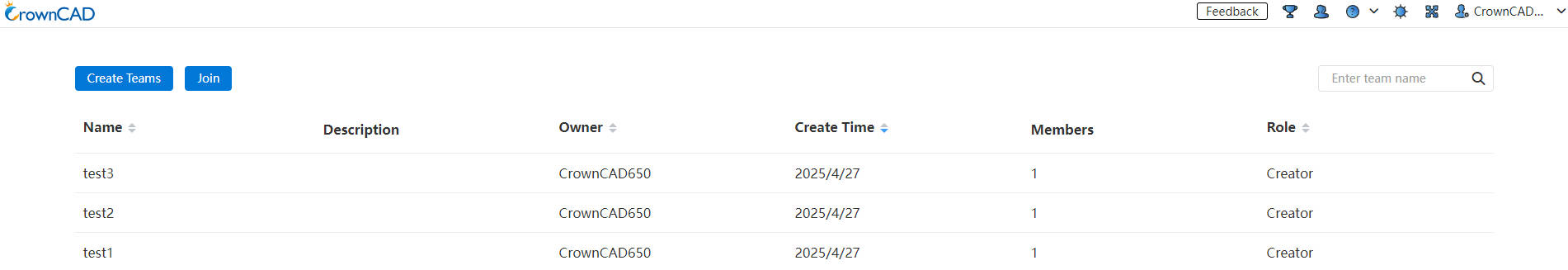
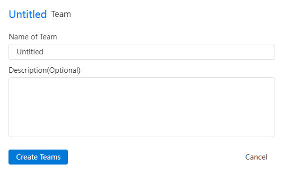
# Create teams
Click to enter the Create a team screen, enter the content as prompted, and create a team. The created team is displayed in the team list.
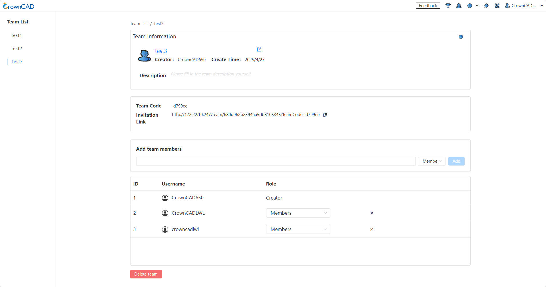
# Team Management
Access the team interface: In the team list, left-click on the team name to enter the detailed team interface. In this interface, you can "add team members" and assign them roles such as member or administrator; you can also delete the team.
Team management: The team includes three types of roles—creator, administrator, and member—with different permissions assigned based on the role:
Team Creator's Right-Click Permissions:
Single-select/multi-select projects created within the team: Tag, Move, Copy, Team Copy, Delete, Transfer Ownership.
Single-select/multi-select folders/projects created within the team: Move, Copy, Team Copy, Delete, Transfer Ownership.
Single-select/multi-select shared projects/folders (all documents owned by the creator): Copy, Team Copy, Cancel, Delete.
Multi-select projects/folders that include both team creations and those shared by the creator: Copy, Team Copy, Delete.
Multi-select projects/folders that include both team creations and those shared by others (administrators or members): Copy, Team Copy.
Multi-select projects/folders shared by both the user and others (or exclusively by others): Copy, Team Copy, Cancel.
Team Administrator's Right-Click Permissions:
Single-select/multi-select projects created within the team: Tag, Move, Copy, Team Copy, Delete.
Single-select/multi-select folders/projects created within the team: Move, Copy, Team Copy, Delete.
Single-select/multi-select shared projects/folders (all documents owned by the creator): Copy, Team Copy, Delete.
Multi-select projects/folders that include both team creations and those shared by the creator: Copy, Team Copy, Delete.
Multi-select projects/folders that include both team creations and those shared by others (administrators or members): Copy, Team Copy.
Multi-select projects/folders shared by both the user and others (or exclusively by others): Copy, Team Copy.
Team Member's Right-Click Permissions:
Single-select/multi-select projects created within the team: Tag, Copy.
Single-select/multi-select folders/projects created within the team: Copy.
Single-select/multi-select shared projects/folders (all documents owned by the creator): Copy, Delete.
Multi-select projects/folders that include both team creations and those shared by the creator: Copy.
Multi-select projects/folders that include both team creations and those shared by others (administrators or members): Copy.
Multi-select projects/folders shared by both the user and others (or exclusively by others): Copy.
- Inviting members: Use a team code or invitation link on the team management page to quickly invite members to join.
- View Teams: Created teams are viewable in the left-side panel. Projects created under the team can be viewed and edited by all team members.
# Labels Management
This system enables the addition of tags to projects created within a team, facilitating efficient project management. Moreover, it allows users to quickly locate specific projects by filtering through applied tags.
How to use:
1) Team creators, managers, and members can add labels to team projects by right-clicking on the "Labels" option, enabling efficient labels management for subsequent project organization.
2) Within the team's “Labels” dropdown menu, you can view and filter all labels that have been created by team members.
- Details:Click the details option located at the upper right corner of the team interface to review comprehensive information about projects and folders within the team.
# Dissolve Team
When dissolving a team, the ownership of team projects can be transferred, along with the ownership of the outermost folders under these projects.
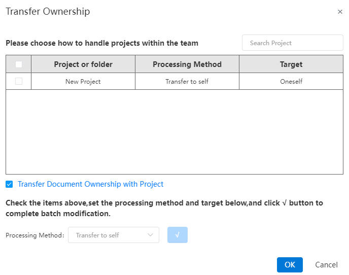
How to use:
1) Open the team to be dissolved in the Team Management interface.
2) Click "Delete Team" and "OK".
3) A dialog box "Transfer Ownership" will pop up.
4) In the dialog box, select the team projects or folders you want to transfer ownership of, and choose the processing method below. The available options are: "Transfer to self," "Transfer to team," "Transfer to user," or "Delete."
5) Click "✓" to complete the settings for the selected items.
6) Repeat steps 4~5 to set processing methods for all projects.
7) Click "OK" to transfer ownership of the team as configured and delete the team.
# Official WeChat
Hover the mouse over the icon  to display the QR code for our Official WeChat account. You may scan it to add us.
# Setting
System Settings are divided into 3 categories: System Setting, Customize, Icon Size. System Setting are divided into System Option and Document Attribute, Document Attribute are only displayed when the System Setting are opened in the document, and the Tab page is not displayed when the System Setting are opened in the project interface.
- System Setting: Click Setting
 to enter the System Setting interface.The interface supports the setting of language, theme, view operation, import and export, template, unit, drawing standard, etc.

- Customize:Click the arrow on the right of the Settings, and click Customize in the drop-down menu to enter the Customize Settings screen. The interface can set the icon display style, shortcut bar, keyboard, and mouse gestures.

- Icon Size: The size of icons in the modeling interface can be selected in the icon size settings.
# System Setting-General
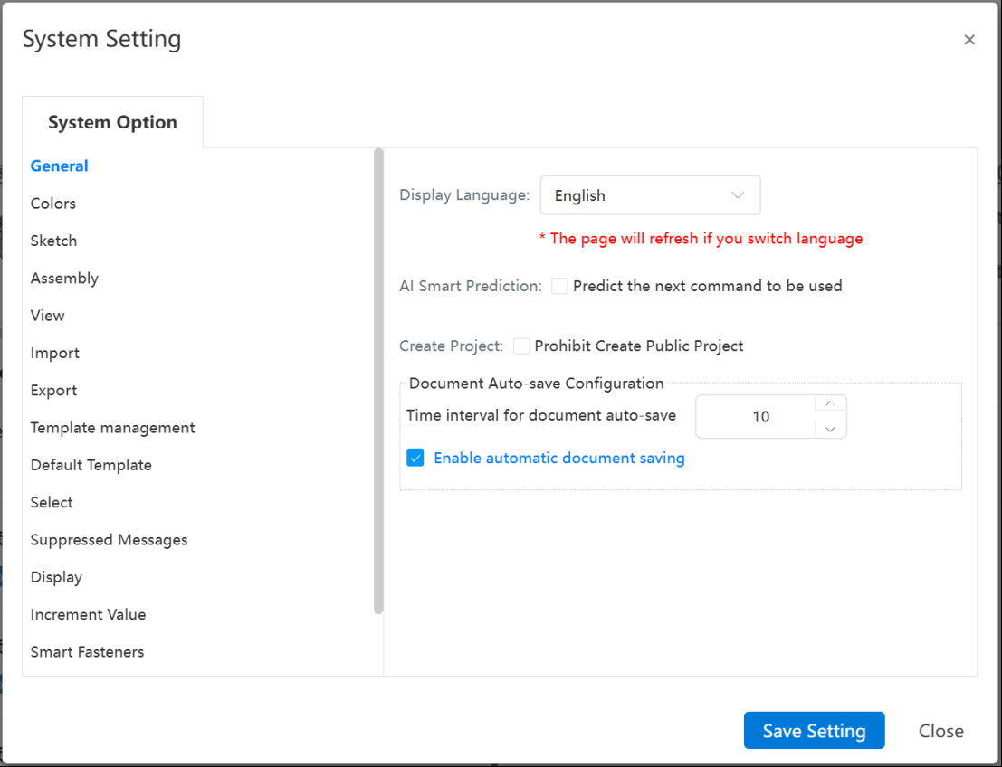
Language: CrownCAD currently supports Chinese and English. Switching the language will automatically refresh the webpage.
AI Smart Prediction: Controls whether to enable the AI smart prediction function. When enabled, predicted commands will be displayed in a pop-up menu upon selecting elements.
Create Project: If Disallow creating public projects is checked, the Public option will be unavailable when creating a new project, preventing data leakage caused by accidental operations.
Document Auto-save Configuration: Controls whether to enable the auto-save function and sets the auto-save interval. When enabled, the document will be auto-saved once the number of operations reaches the set value.
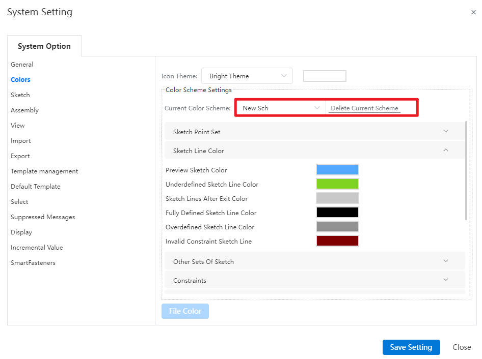
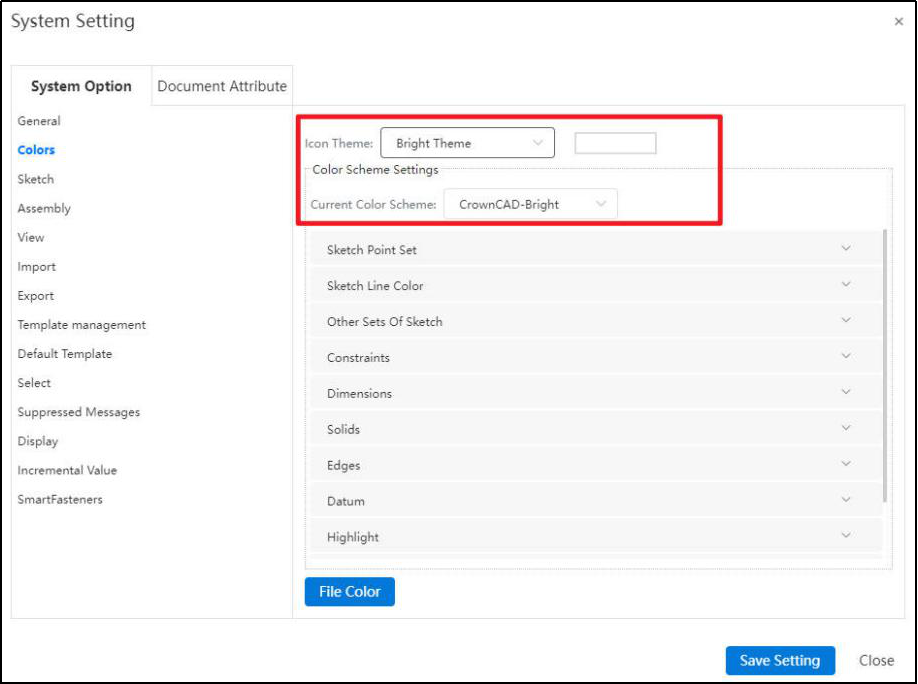
# System Setting-Colors
- Color:Set the toolbar, background color, line, drawing color, etc. of the system as a whole.
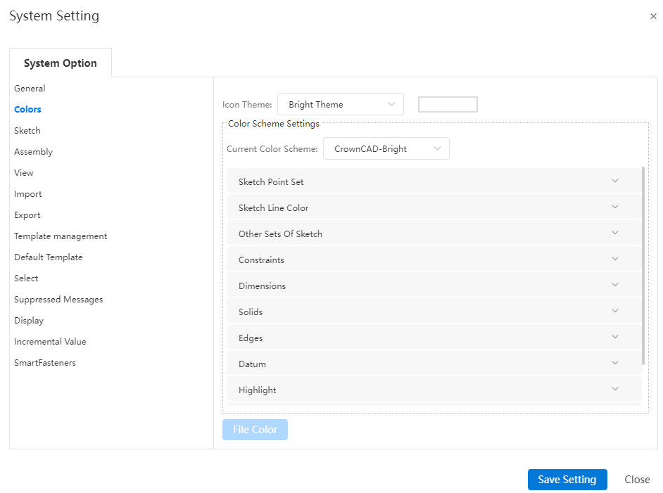
Icon Theme:Provide dark, bright two themes, the user initially selected, will provide a matching view color scheme according to the icon theme.
Color scheme:6 default schemes are provided -CrownCAD Bright, Dark, SolidWorks, CATIA, UG, Creo. The default scheme is not allowed to change, after the user changes, the current scheme will be saved as a new scheme, the user can customize the new scheme name.
# System Setting-Sketch
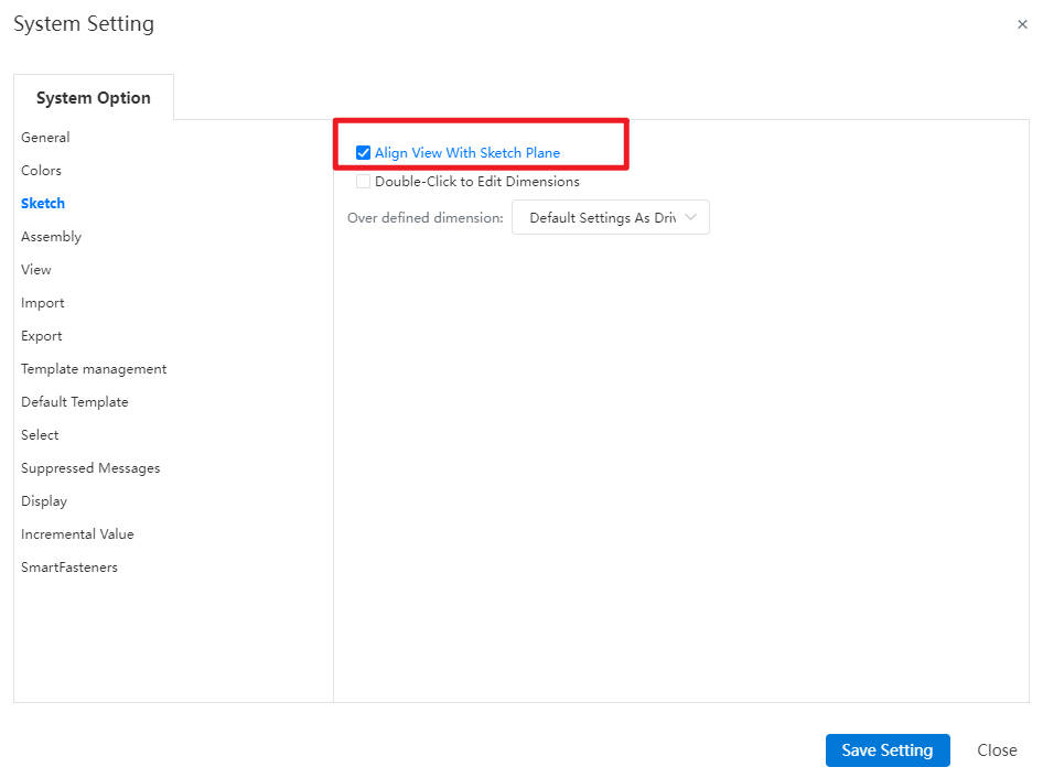
1.Auto-rotate view normal to sketch plane: When clicked, this feature enables automatic view rotation to align perpendicularly with the sketch's datum plane during sketch creation and modification.
2.Double -click on the feature to edit dimension: Controls the effect of double click feature/sketch edit size.
| The "Double click Feature Edit Size" option checks the status | Double Click Feature Effect | Double click Sketch effect |
|---|---|---|
| Tick | Show the dimensions of the feature and feature association sketch | Shows sketch size, does not enter edit sketch state |
| Unticked | Only feature sizes are displayed | Go to edit sketch state |
Note 1:In the size display state, click anywhere in the viewport or list to turn off the displayed size.
Note 2:This function can only be used outside of the sketch, double clicking on the feature/sketch while editing the sketch will not show the size.
Note 3:Overdefined Dimensions: Sets the default handling of overdefined dimensions.
# System Setting-Assembly
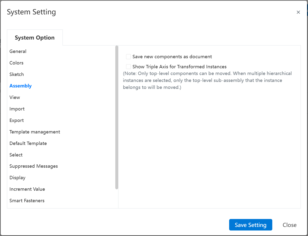
Used to configure functions related to assemblies. For details, refer to the "Assembly" module.
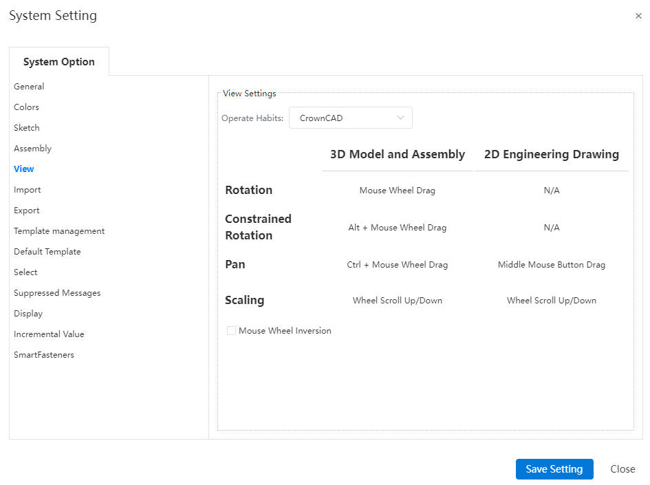
# System Setting-View
- View Operations:Set common shortcut keys for view operations. The default view shortcut is CrownCAD custom. You can switch to the shortcut keys of other 3D software, including Solidworks, NX, Creo, AutoCAD.
- Mouse wheel reverse:Reverses the zooming in and out effect while scrolling the wheel in the viewport.
# System Setting-Import
- General:Can set whether to import hidden elements, file thumbnails, file name source, and resolution (import model precision).
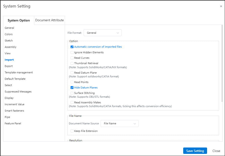
Automatic conversion:After checking the "Auto-convert imported files" option in the settings, all documents in the compressed package will be automatically extracted and converted.
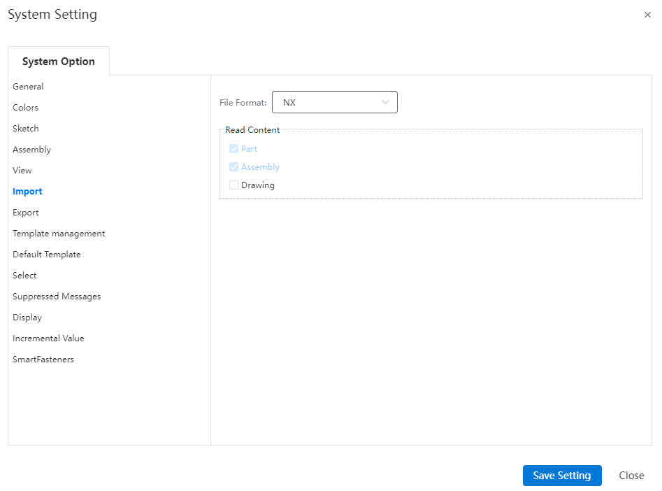
NX:You can set whether to import the drawing file synchronously when importing the NX format file. After being ticked, the NX drawing will be converted and imported as a dwg file.
# System Setting-Export
- Export:
- STL: Allows configuration of the output unit and output quality for exported STL files.

- DWG/DXF
When exporting the engineering drawing in DWG/DXF format, you can choose the drawing or a certain view scale, reverse scale the entire drawing, so that the exported drawing model line length is consistent with the actual length; You can set whether to activate this function in system Settings - export.
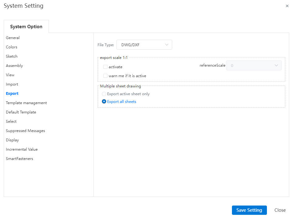
Matrix ratio is used to select the scale of the whole when exporting.
- Typically, most of the views in the drawing refer to the drawing scale, so choosing the drawing scale will make the model line length in most of the views the same as the actual length.
- In special cases, the view may not use the drawing scale, in which case you can specify the matrix scale for that view, and the system will scale by reference to the scale of that view.
Multi-Sheet Drawing: Controls which sheets are exported from a multi-sheet drawing.
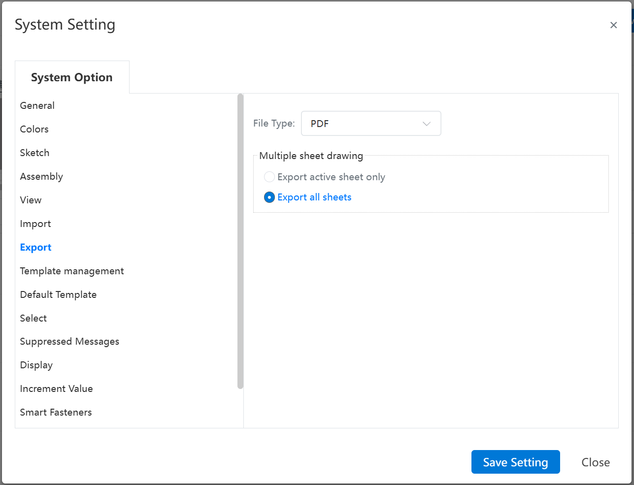
Multi-Sheet Drawing: Controls which sheets are exported from a multi-sheet drawing.
# System Setting-Template Management
- Template Management:Support parts, assembly, drawings, custom properties, BOM export, cut list properties, weld contour, Font, Bend Table, Hole Favorite, Table Template, Total Tolerance Table, support template creation, modification, deletion, renaming and other operations.
Note: All default templates do not allow modification, deletion or renaming.
- Management of parts, assembly, drawings templates:
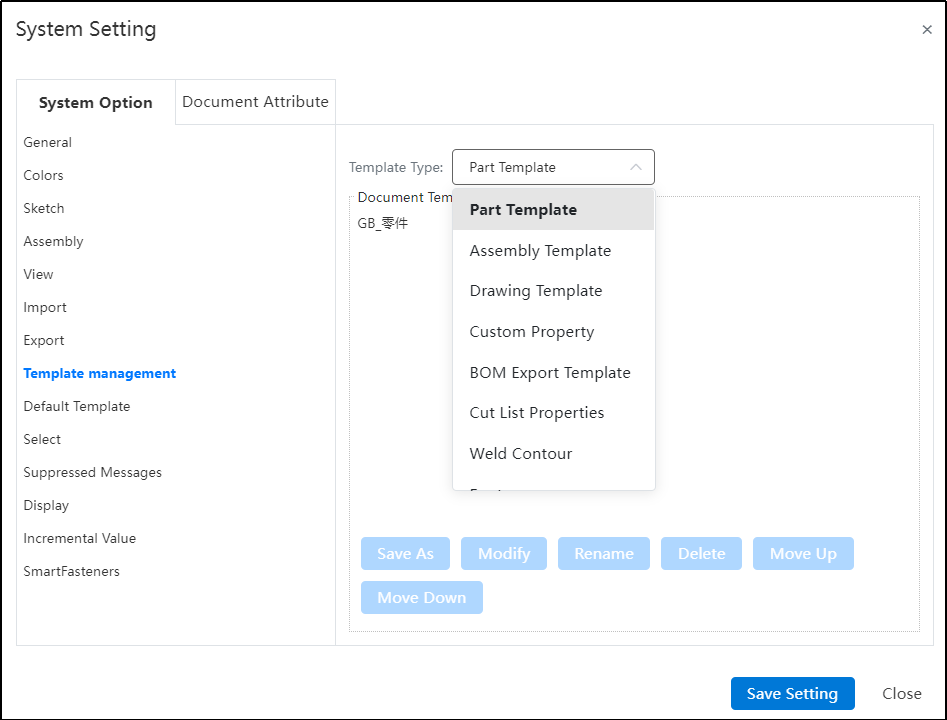
- 【Save as】 Quickly copy existing templates to create new template documents;

【Modify】 After selecting the template, click Modify to open the template document, the overall interface is the same as opening the ordinary document.
In the template document, you can modify the model data, document property Settings and other information.
| Data information recorded in the template document: | |
| Model data class information | solid, surface, appearance, drawing format, etc |
| Document property setting information | font style and size, arrow style and size, unit, tolerance, zero display, line type, line thickness, etc |
| Other stencil information | Drawing format template (drawing only), property template, material detail sheet template, export BOM template, etc |
【Rename】 Rename the selected template. The template name must be unique.
【Delete】 Delete an existing template. Deleting the template does not affect the existing document.
【Move Up/Down】 Change the order of the template, where the order corresponds to the order of the template when creating the document.
【Share】: Click to share the template with other users, only the custom template can be shared.
Note:
① References to other documents are not allowed in the template: assembly templates do not allow parts to be inserted, and drawing templates do not allow model views to be generated;
② Modifying the template only affects subsequent documents created using the template, not existing documents;
- Customize the management of properties templates:
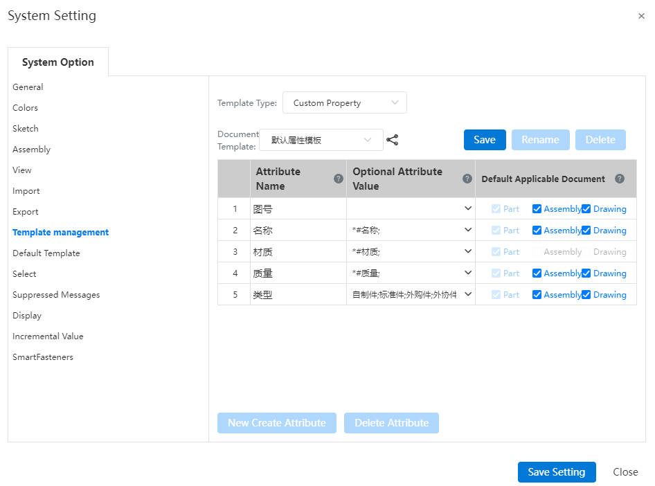
At first, only the default template, after the user modifies the table content, click Save as to save it as a new template;
After selecting the template to be modified, the template can be saved as, renamed or deleted:

Attribute Template Content Management:
The property template is a common property, and the common property values are valid for all branches of the document.
The initial attribute template covers five types of attribute information: image number, name, material , quality, type. You can add the attribute category by clicking New Create Attribute:
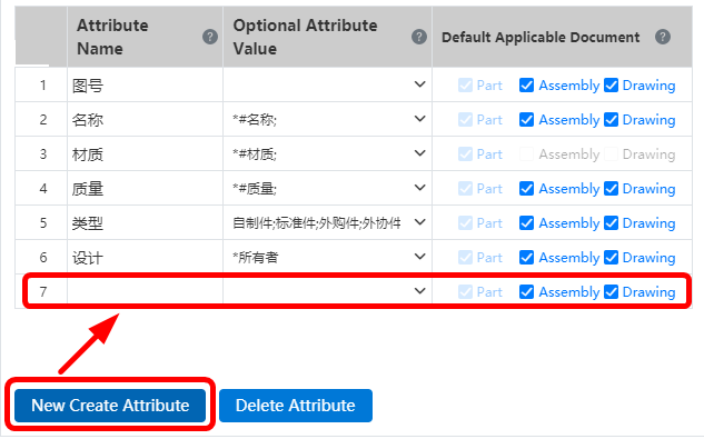
Click New Create Attribute, add a line of blank attribute at the bottom, and fill in the related content as follows:
① Property Name: Double-click to enter the editing state, you can customize the current property name;
② Attribute Value: enter the options in the drop-down box of this property, when selecting multiple values, separate different options with semicolons (adding * before the option represents the default option); Optional property values support associated document properties and input detailed property values,

③ A # symbol before the attribute value indicates that this value is an associated attribute. When filling in the attribute, it is automatically associated with the relevant information of the document. Currently, the following associated attributes are supported:
| 1 | #Name | Associated document name |
|---|---|---|
| 2 | #Material | Material set by the associated document, blank if no material is set; |
| 3 | #Quality | Calculated by material and volume, displays blank when no material is set; In the assembly is the sum of the instance quality of each part |
| 4 | #Owner | The user name of the document owner |
| 5 | #Editor | The username of the most recent editor of the document, associated with the most recent editor in the document list |
④ Default applicable document: After being selected, this attribute is displayed in the [Document Attribute] of the corresponding type of document. The new attribute is selected by default for all documents, and can be customized to be selected; If the optional property value is selected, the system automatically configures the applicable document;
| Stats Value | Default Applicable Document |
|---|---|
| #Name | Part, assembly, drawing |
| #Drawing number | Part, assembly, drawing |
| #Materials | Part |
| #Weight | Part, assembly, drawing |
| #Owner | Part, assembly, drawing |
| #Editor | Part, assembly, drawing |
Note: Document templates Document property templates:
For example: Create A part template and set its property template to A. When you create A document with this part template, the document's property template automatically selects Property template A. You can manually modify the selection of other property templates after entering the part document.
If the property template associated with the part document is deleted, switch to the default property template.
- BOM export template management:
Supports custom Settings for the level table template and specification template of the exported BOM table.
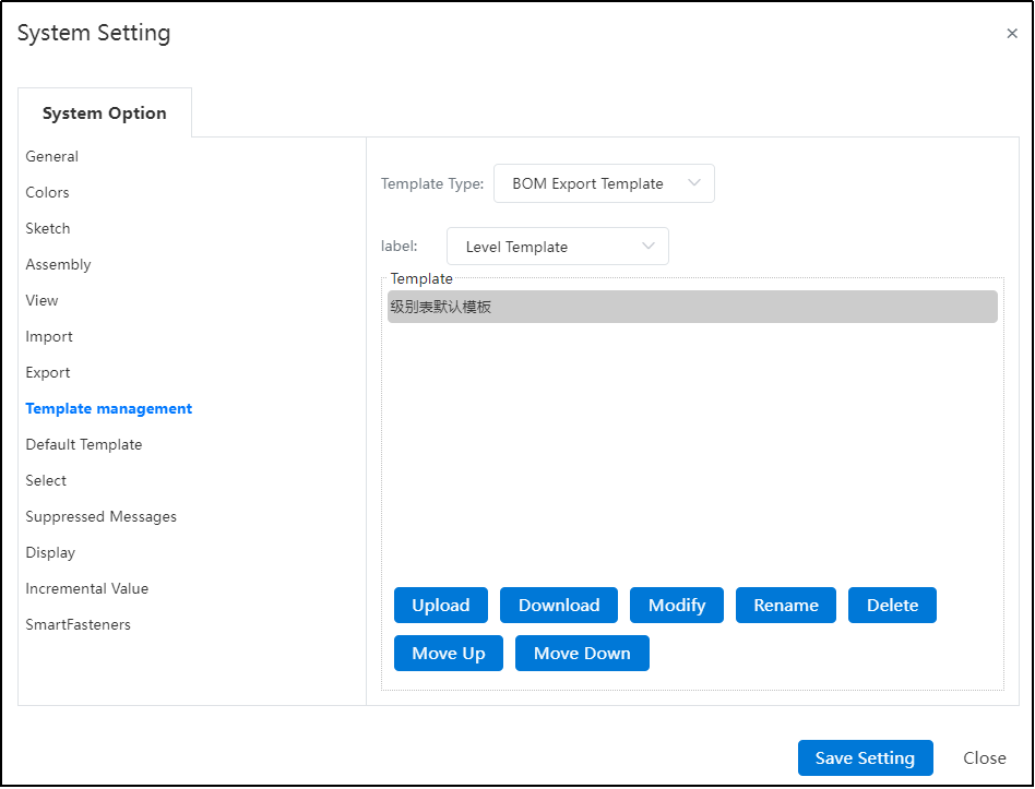
[Upload] An Excel file that complies with the BOM format and identifies the generated template after the file is uploaded.
The correct and formatted Excel file should include Tables 1 and 2:
Table 1(sheet1)- Used to set the template table header, table tail, table color, border width, etc.;
Table 2(setting)- Used to set the position of each document property to fill in the table, whether the page is broken, etc.
- The first line sets the property entry to be displayed and the name of the property entry in the table, in the format of "property entry; Name in table;
- The second line sets which row (English) or column (number) the property entry is placed in;
- Other setting items:
Settings items Instructions Starting line number The line from which the data is written Property name To which cell the property value in the assembly square brackets is written, such as "[combined form] P4" then the assembled combined form property value is written to P4 cell Number of rows in the table header Used to specify the starting and ending rows of table headers in Sheet1, such as "1:4" The number of last rows in the table Used to specify the starting and ending rows of the table tail in Sheet1, such as "1:4" Pagination by row If yes is selected, create a new page of worksheet when more than the specified number of rows is exceeded; Otherwise all data is placed on the same page worksheet Number of rows per page This is required when "Yes" is selected only by line page, and a new worksheet is created every time you exceed these lines when you specify the number of lines Insert the end of the table for every number of rows Pagination by row only required when "No" is selected, used to implement print pagination in Sheet1. If you select Yes by row paging and do not fill this item, insert the end of the table at the end of all data
【Modify】 Select the template to be modified, click Modify, (do not select the template, the modify button cannot be clicked) pop-up modify dialog box.
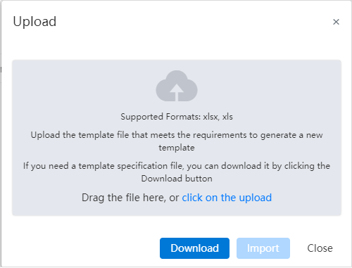
Click Download to download the selected template source file to the local, after the local modification, drag the file into the dialog box and click Upload, replace the selected template to complete the modification.
Note: You can directly upload the template file that meets the requirements without downloading it, or you can complete the replacement.
- Management of cutting list properties template:
The cutting list property template is modified and created in the same way as the custom property template.
See Cutting List Properties for detailed parameter descriptions of properties.
- Management of weldment contours
Supports custom Settings for the current structure component profile library.
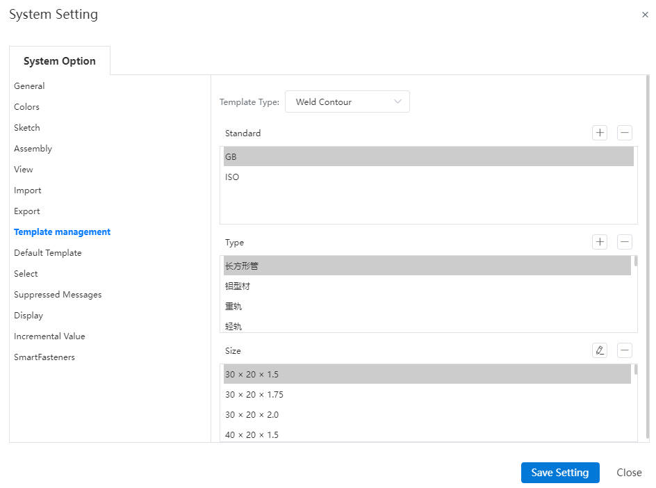
- Standard: The default only GB standard, support to add/delete other standards, the default template can not be deleted;
- Type:Displays all types of profiles under the GB standard by default, other types can be added under GB or other standards, and the name can be customized; The default type does not support deletion;
- Size:The size of the current outline can be adjusted after selection; The default size cannot be edited; For details about adding and editing contours, see Customizing Structure Member Contours.
- Font Management
Support importing custom fonts and other settings.
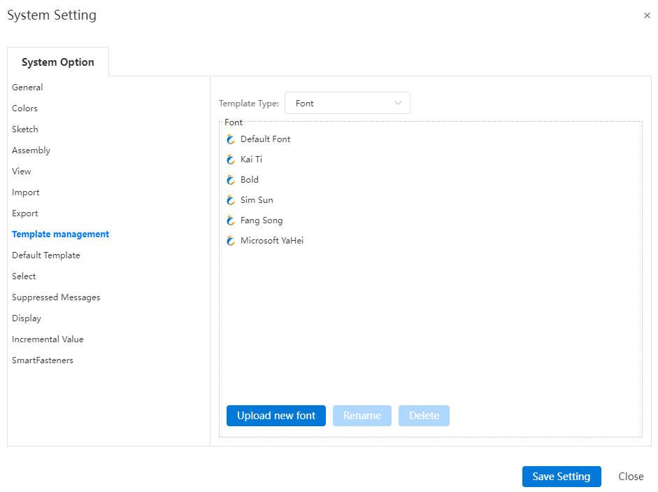
【Font】By default, the Fonts settings display all existing fonts (including system presets and imported ones). They support rename and delete operations. However, default font types do not allow renaming or deletion.
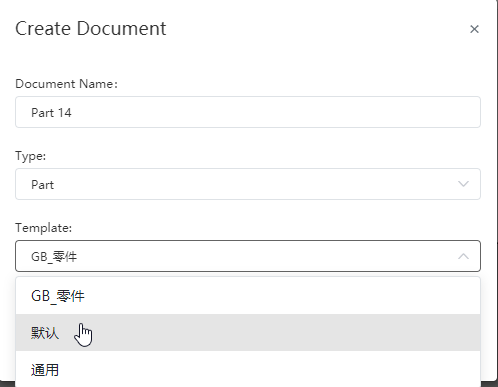
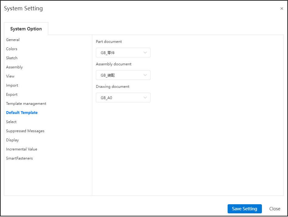
# System Setting-Default Template
- Default Template:Set the template selected by default when creating a new document.
# System Setting-Select
Enable Selection through Transparent surface: When checked, you can pick up the elements behind through the transparent surface.
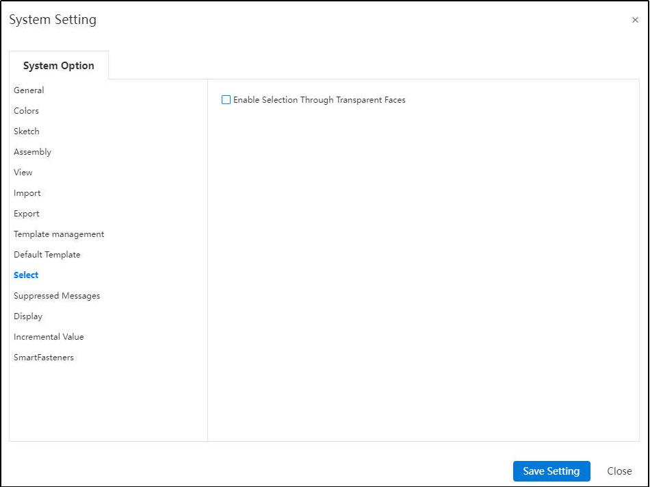
The system supports holding the Shift key during element selection to temporarily toggle the "Enable Selection Through Transparent Faces" setting in the system settings.
Note:
When selecting elements without pressing Shift, the behavior remains consistent with the current checkbox status.
If the option is currently enabled (checked), holding Shift will act as if it was disabled (unchecked).
If the option is currently disabled ( unchecked ), holding Shift will act as if it was enabled ( checked ).
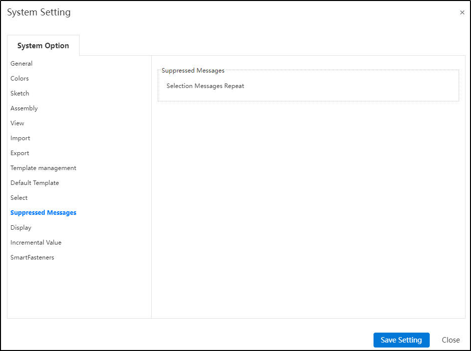
# System Setting-Supressed Message
Some messages, after selecting "No more prompt", can be modified here to restore prompt.
# System Setting-Display
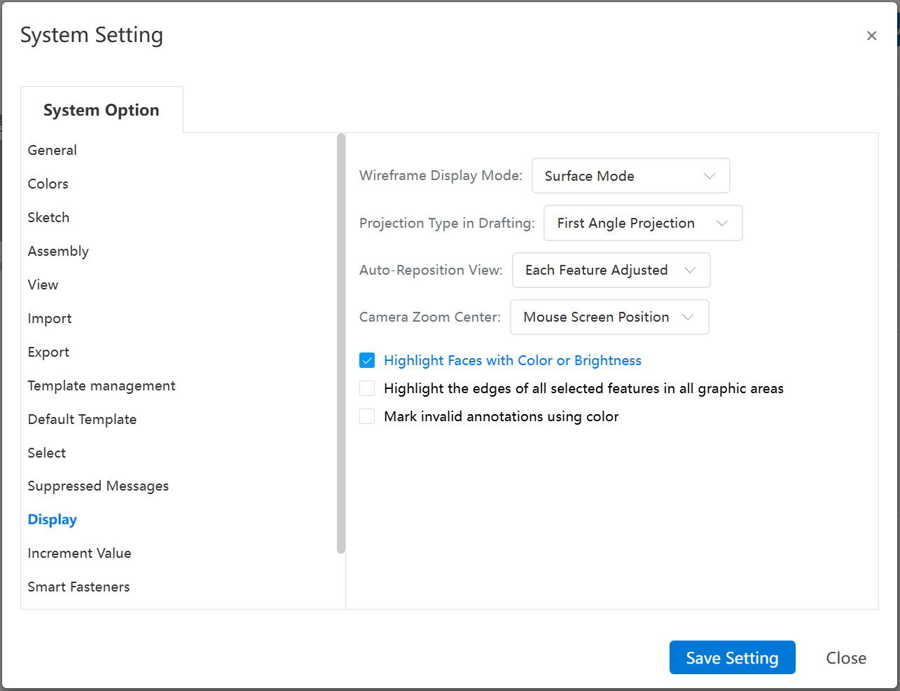
【Wireframe Display Mode】: Set the display mode for grid-based geometry objects.
【Project Type in Drafting】: Set the default projection type for engineering drawing views.
【Auto-Reposition View】: Choose whether to enable automatic adjustment of view orientation.
【Camera Zoom Center】: Specify the reference point around which camera zoom operations are performed.
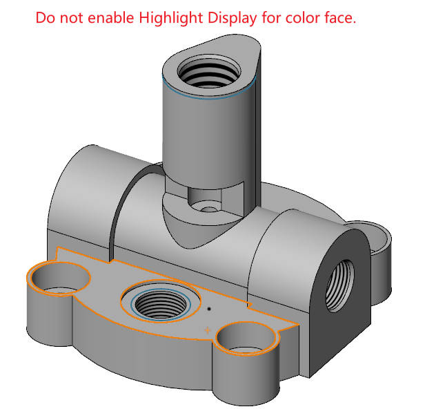
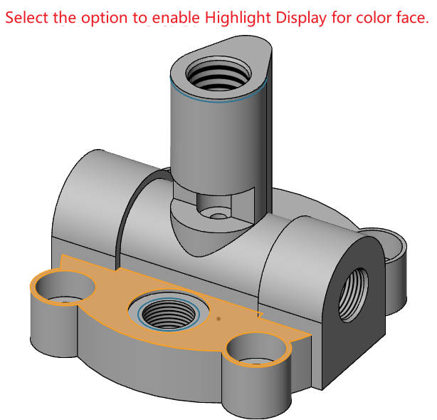
【Highlight Faces with Color or Brightness】: Control whether a colored surface is highlighted when selected.
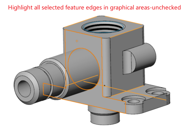
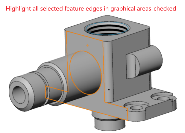
【Highlight the edges of all selected features in all graphic areas】:When controlling the picking of a face, you can choose whether to highlight the feature edges belonging to the face at the same time.
【Mark Invalid Annotations Using Color】: When enabled, annotations will turn yellow-green if they become invalid due to model changes or other reasons.
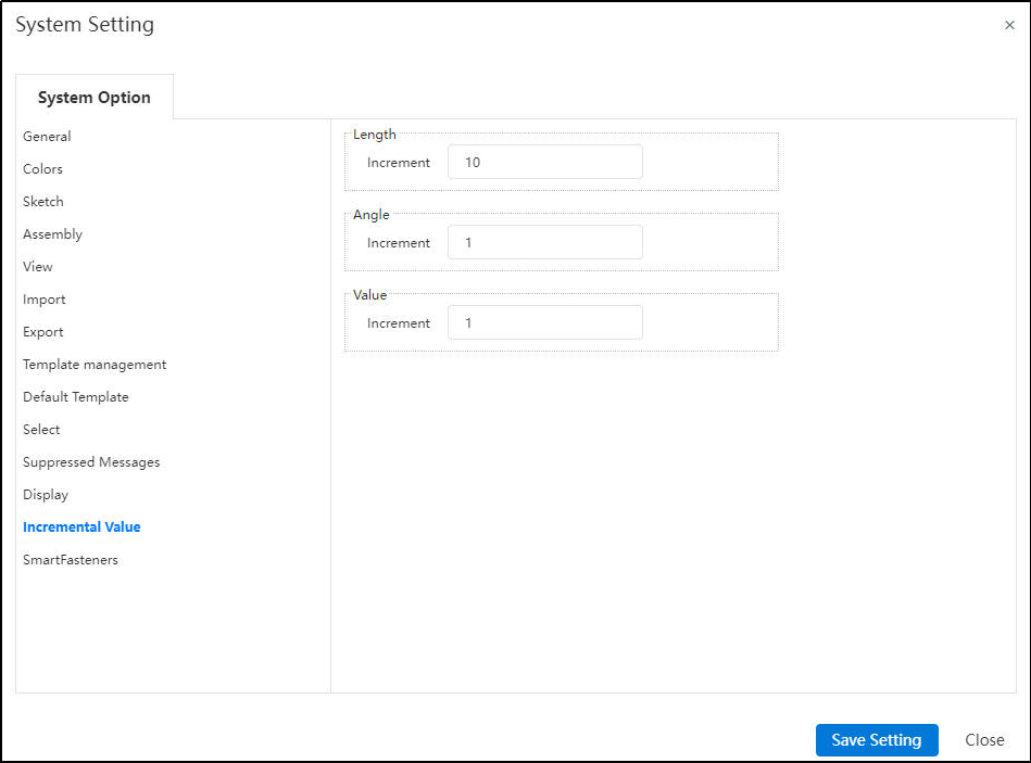
# System Setting-Increment Value
Set the default increment value for each click of the up and down arrow to the right of the value input box.
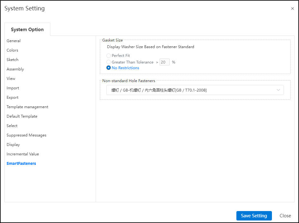
# System Setting-Smart Fasteners
Customers can freely choose the gasket size and select the appropriate bolt or screw type for non-standard holes based on their specific requirements.
# System Setting-Feature Panel
Allow direct renaming of documents within the project document, without having to exit the document and return to the project management interface for renaming.
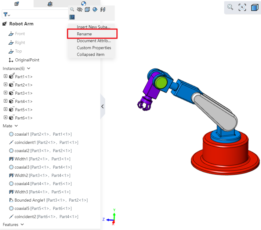
How to use:
Open "System Settings - Feature Panel" and check "Allow renaming parts via Feature Panel."
In the opened project document, right-click the document name and select "Rename" to rename it.
Note: In part documents, the corresponding command is "Rename Part"; in assembly documents, if renaming the entire assembly, the corresponding command is "Rename Assembly". If renaming an inserted instance, the corresponding command is "Rename"; in drawing documents, the corresponding command is "Rename Drawing".
# System Setting-Pipe
Allows setting of detailed functions for the pipeline module.
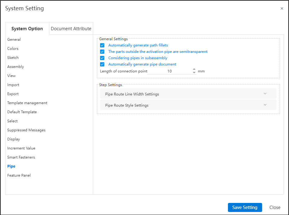
Dialog Box Control Instructions:
Automatic path fillet generation: When creating a path or performing automatic routing, automatically add a fillet between two adjacent path lines at their turning points.
Transparency of external piping components: When activating a piping route, display other components in a semi-transparent manner.
Sub-assembly piping count: Control whether piping within sub-assemblies appears in the "Enter Piping" command. If this option is unchecked, when selecting a sub-assembly containing piping in the assembly and clicking "Enter Piping," the piping name within that sub-assembly will not be displayed in the "Enter Piping" dialog.
Connection point length: Control the length of connection points displayed in the model.
Path settings: Used to control path-related parameters.
Path line width: Set the display width of the path.
Path style: Set the display style of the path. Default is line style, but circular style is also available.
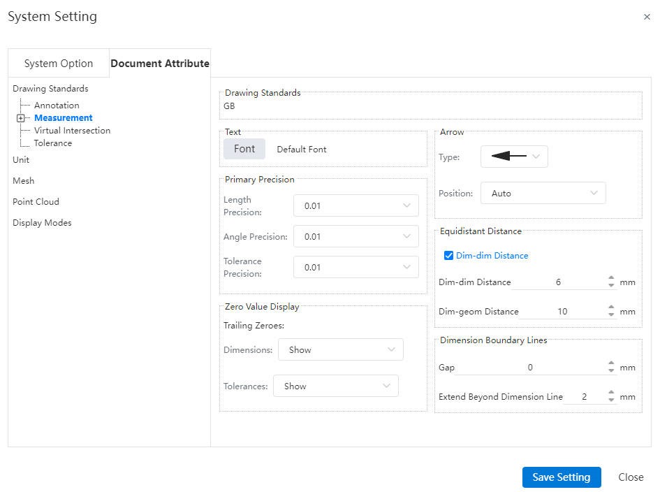
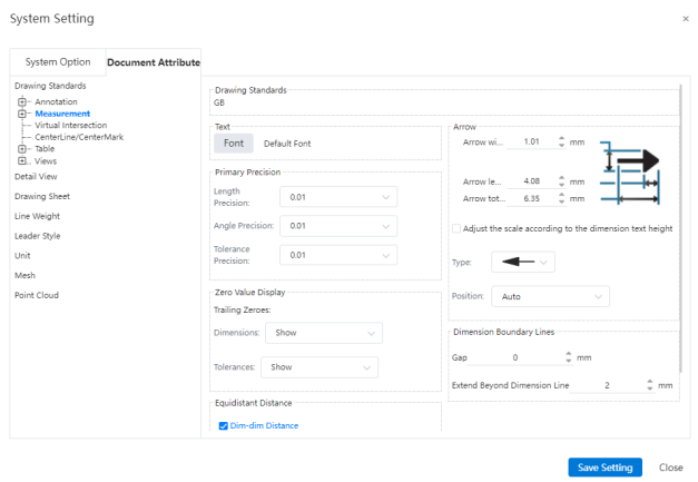
# Document Attribute-Drawing Standards
Drawing standard: Currently supports GB, ISO, ANSI, JIS, and DIN standards. Custom standards can be created to configure the text and arrow styles in annotations and dimensions, as well as the display mode for zero quantity in the Bill of Materials..
Annotation:
System Settings - Document Properties - Annotation Attachment Location, Horizontal Line, and Trailing Zero Value Settings.
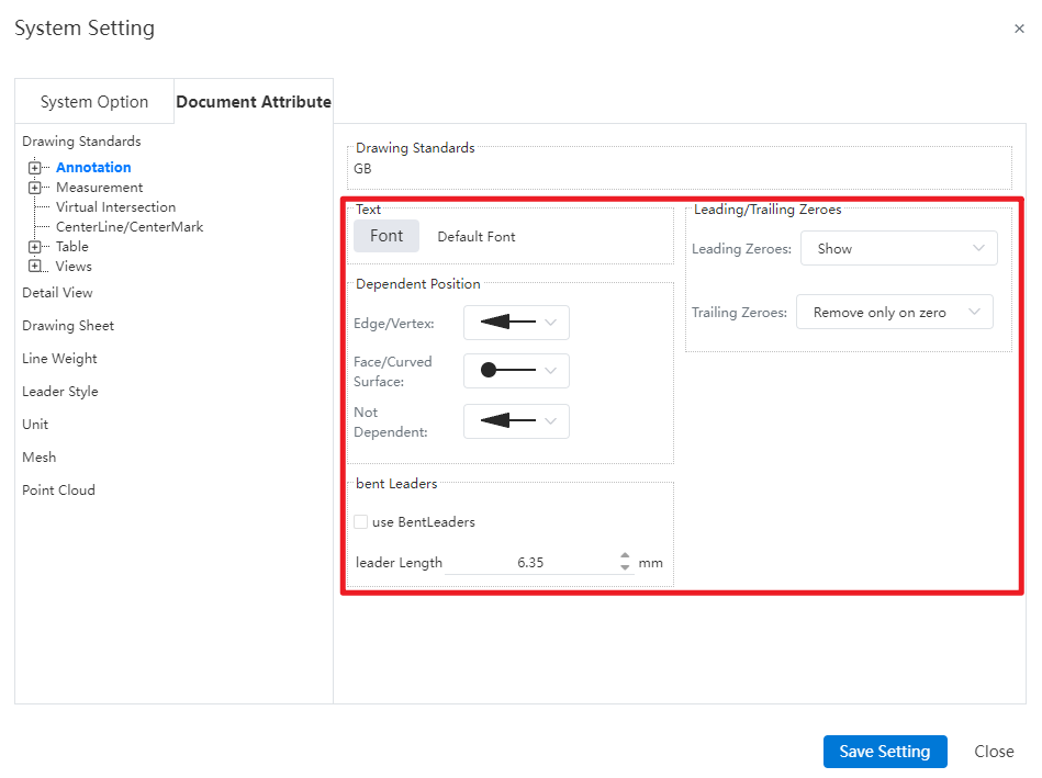
Note:
Attachment Position: Supports setting different default arrow styles for creation based on attachment position in document properties.
Horizontal Leader Lines: Controls whether horizontal leader lines are used by default and allows setting the leader line length.
Leading/Trailing Zero Values: Supports configuring the display format for "leading zeros" and "trailing zeros," controlling how values obtained through associated properties (e.g., mass, length) are displayed in annotations.
Font:
Allows setting different fonts individually for annotations in the system settings.
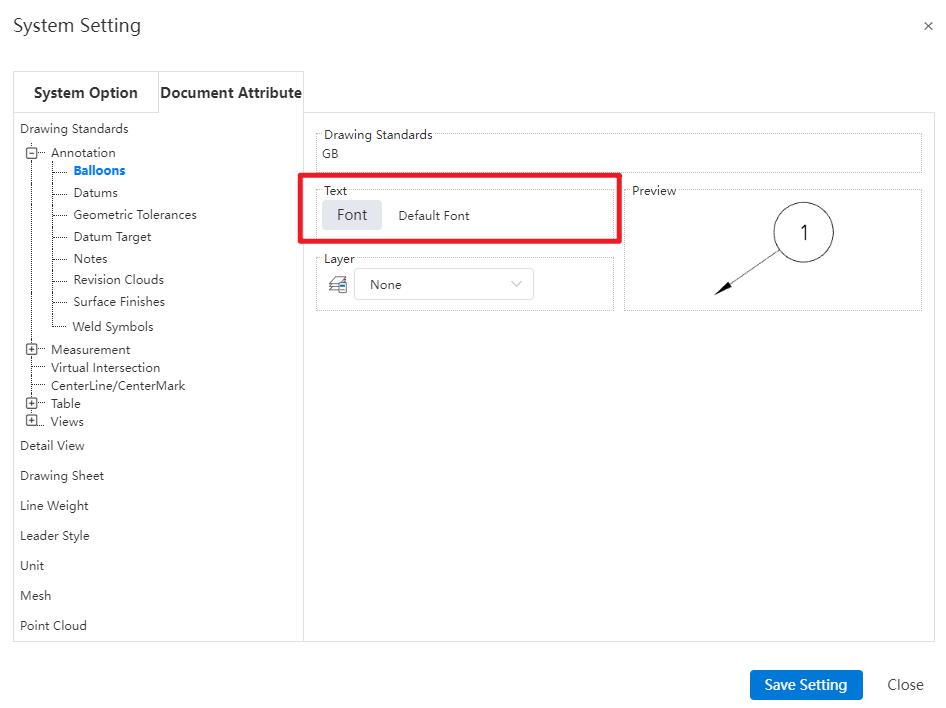
Note:Support individual font configuration for different annotation types under annotations, with font style settings displayed as images in the preview.
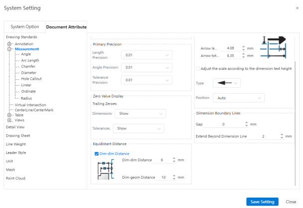
Measurement:
Support detailed customization of dimension styles.
Note:
Arrow size: Supports setting the style of dimension arrow size, allowing individual adjustments for arrow width, head length, and head plus leader length (leader extending beyond the arrow). It also allows setting the default arrow type and default arrow position when creating dimensions.
Trailing Zeros: Support for setting the display effect of trailing zeros in "Document Properties - Dimensions" and "Document Properties - Dimensions - Angles".
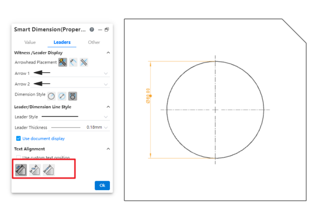
Text Position: Supports setting the default text position for corresponding dimensions in "Document Properties - Dimensions - Angles, Arc Length, Chamfer (Leader Only), Diameter, Radius (Leader Only), Linear". Controls the default state of the "Custom Text Position" option in the respective dimension commands.
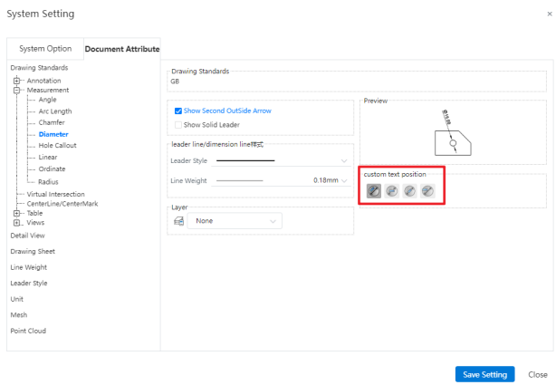
- Leader/Dimension Line Style: Supports setting the line style and line width of leaders for corresponding dimension annotations in "Document Properties - Dimensions - Angles, Arc Length, Chamfer (Leader Only), Diameter, Radius (Leader Only), Linear".
View-Section View:
Document Properties - View - Section View allows setting of arrow style and line style.
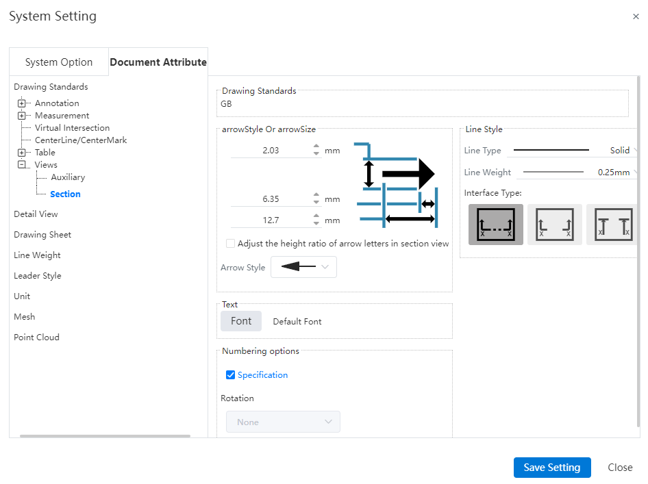
Dialog Box Control Instructions:
Arrow Style and Size:
Arrow Size: Controls the height, width, and total length of section line arrows individually.
Proportional Adjustment Based on Section View Label Font Height: Not checked by default. When selected, the arrow size automatically adjusts proportionally based on the font size of the section view label, and manual input is not allowed.
Arrow Style: Controls the default style of section line arrows.
Line Style:
Line Type: Controls the default line style for section lines.
Line Thickness: Controls the default thickness of section lines.
Connection Style: Allows setting the connection style for section lines. The default is standard with connection. You can choose among three types: standard with connection, standard without connection, and alternative without connection.

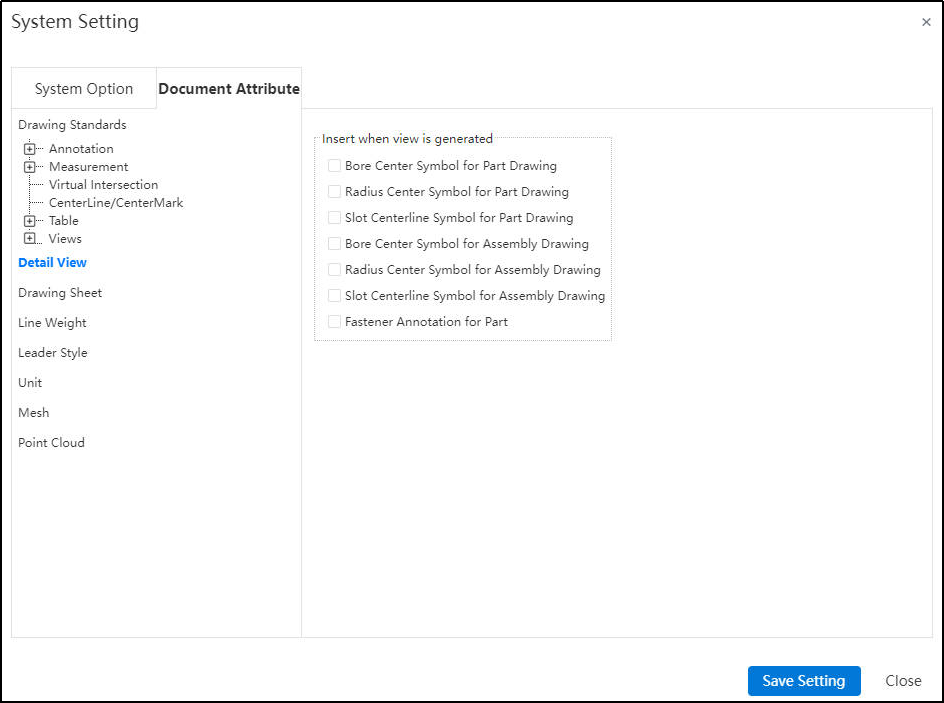
# Document Attribute-Detail View
Set which elements are automatically inserted into the center symbol line when drawing is generated in view.
# Document Attribute-Leader Style
Support configuring the corresponding line styles for different edge lines in engineering drawings, including settings such as edge types and line weights.

Note:
Area Hatch/Fill only support setting line weight, not leader style.
Sketch line weight in drawings do not save to the color scheme.
# Document Attribute-Line Weight
Support configuring engineering drawing document leader thickness.
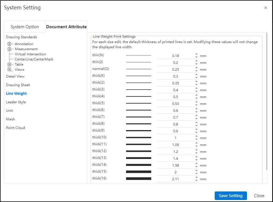
Note:
Line weight settings can only be invoked in drawings; the line weight page is not visible or accessible in parts and assemblies, allowing only the invocation of default settings without customization.
After setting, when exporting or printing, some software or hardware devices do not support customized line weight and will automatically adjust to the nearest available line weight.
# Document Attribute-Display Modes
The system supports model visualization settings, which are interconnected with color settings, enabling mutual navigation and access between them.
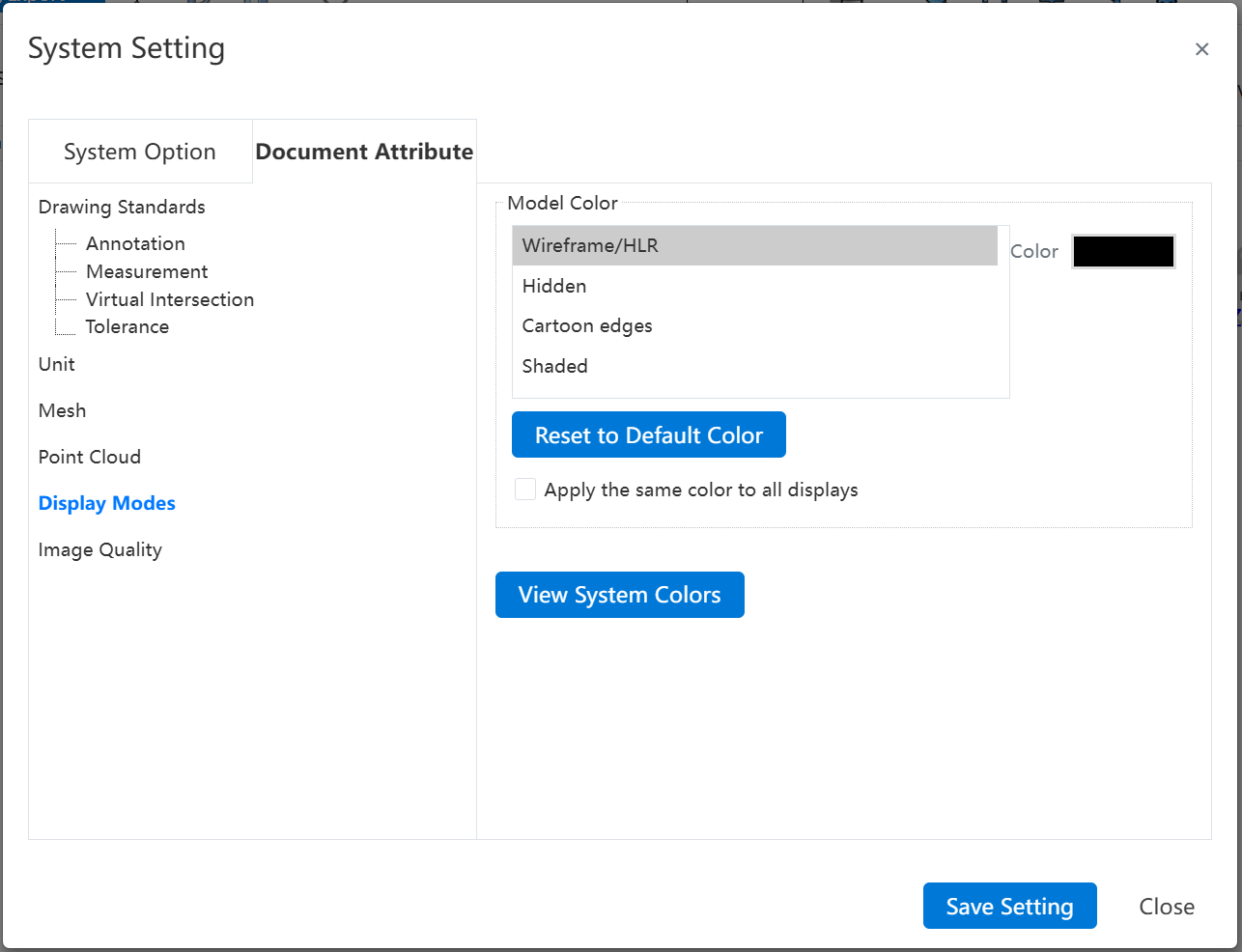
Control Specifications:
Color Shading:Controls the default appearance of parts and maintains bidirectional synchronization with the "Set Appearance" settings at the part level.
Geometry-Solids/Surfaces/Meshes:Manages the visual properties of respective geometries, accessible solely within part document contexts.
Reset Colors to Defaults:Click this button to revert all color settings back to their default system configurations.
Apply the Same Color to All Displays: Combines the settings for "Wireframe/HLR and Shaded" options.
View System Colors:Click "View System Colors" to transition to the "System Settings-System Options-Colors" interface for comprehensive color management.
# Document Attribute-Image Quality
Added image quality setting functionality, supporting the configuration of model display quality, which impacts sub-pixel display, file size, and performance.
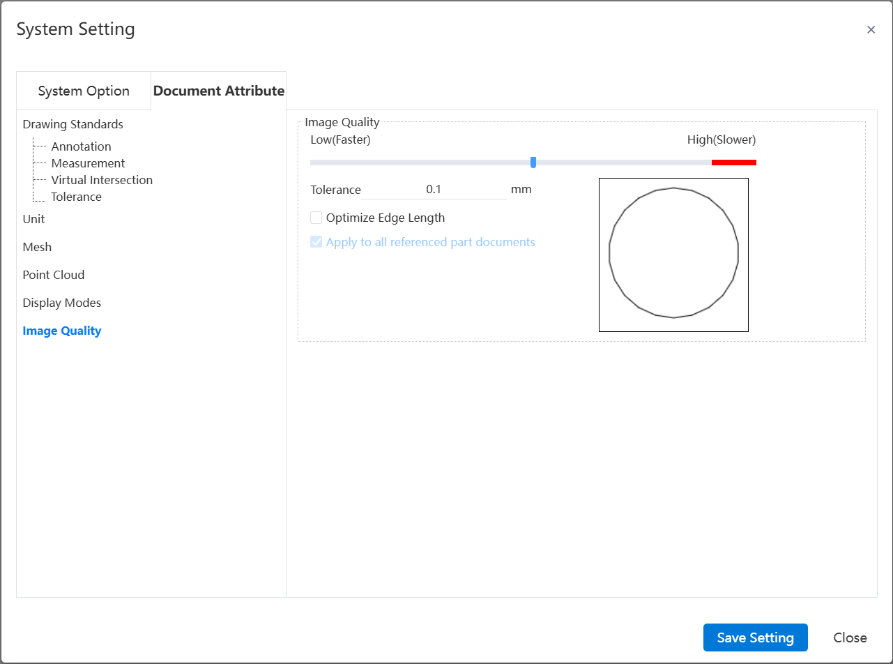
Note: The settings for this interface are saved only with the document and are not saved in the drawing standards.
Control Description:
- Error: Controls the actual maximum chord error. The smaller the value, the higher the display precision.
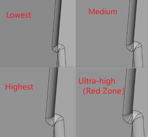
Optimize Edge Length (Higher Quality, Slower): When the error precision setting is at its minimum, selecting this option allows further improvement in image quality.
Apply to All Referenced Part Documents: Selecting this option applies the current assembly document's image quality settings to all referenced part documents, updating the part document's image quality settings to match those in the assembly. Only applicable to assembly documents.
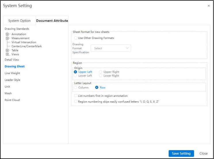
# Document Attribute-Drawing Sheet
Drawing format for the new drawing: If checked, you can set other drawing formats for the new drawing.
Zone: Set the origin of the zone and arrange the letters in rows or columns. You can also interchange the order of numbers and letters in annotations, and skip confusing letters.
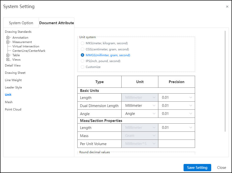
# Document Attribute-Unit
- Units:Choose a preset unit system, or select Custom to set the units and precision yourself.
- Rounding decimals:Can be set to meet the precision Settings of how to round.
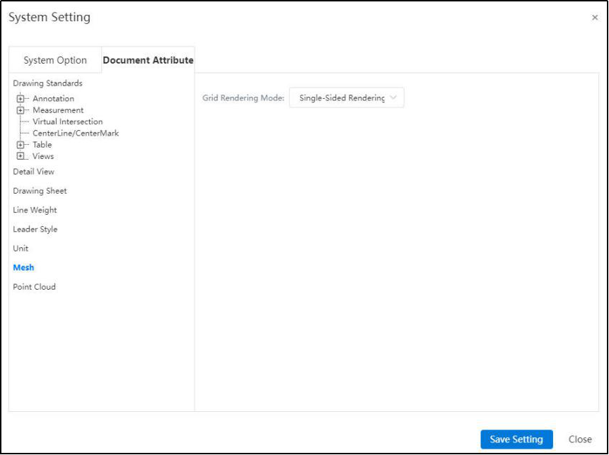
# Document Attribute-Mesh
Grid Rendering Mode: Select Double-Sided Rendering to set the color of the back of the grid.
# Customize-Toolbar
- Toolbar:Toolbar icon display mode can be set, currently there are "Icon Only" and "Icon Text" two modes.

1)Icon Only

2)Icon Text

Function module
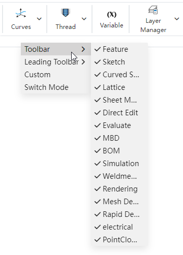
The parts environment function module currently has "Features,Sketch,Surfaces,Sheet Metal,Direct Editing,Evaluate,MBD,BOM,Weldment,Rendering,Rapid Design,Point Cloud,AI Smart Prediction", click the module button under the toolbar to switch modules.

Customize the toolbar
Commands in each module, divided into different groups by vertical lines. Click the divider line to expand and collapse the command group. The toolbar supports explicit modules, groups and commands, and adjusts the grouping order.

Module implicit
Right click on the module button and select the module you want to display from the menu that pops up. The module that is checked is in the display state, and the module that is not checked is hidden.
Group/command hidden
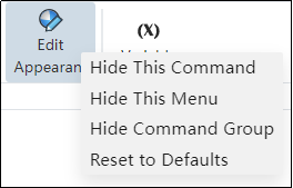
Right-click on any command icon to hide the command or the group in which the command resides from the pop-up shortcut menu.
Adjust the grouping order
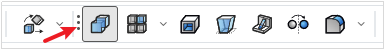
Point your mouse over the group you want to move, and three vertical dots appear to the left of the group. The mouse becomes a cross at this position. Hold down the left mouse button and move around to change the grouping order.
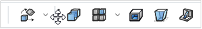
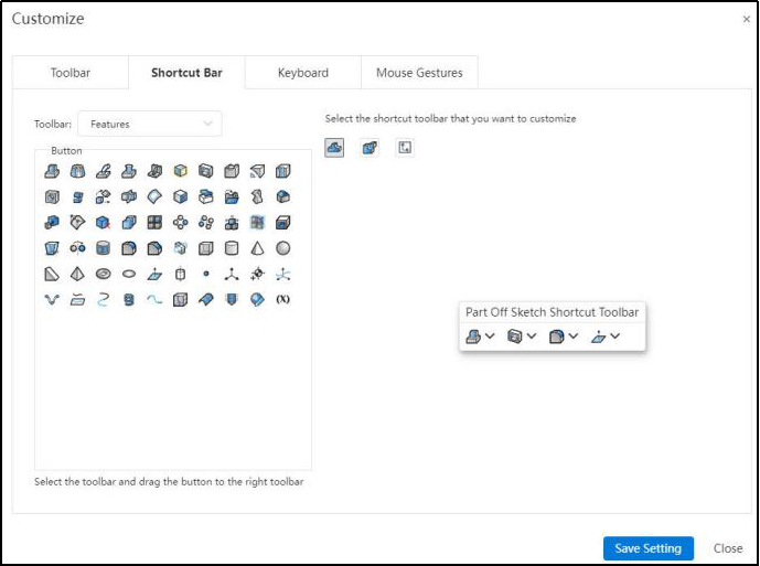
# Customize-Shortcut bar
Can be set in the parts, sketch, assembly environment in the shortcut menu button, modified as follows:
Select the shortcut menu bar under which document/situation you want to modify in the right area, select the module where the button you want to add is located in the left area, and drag the button from the left area to the desired position in the right dialog box. It can be placed in the very front/back end, or inserted between any two buttons.
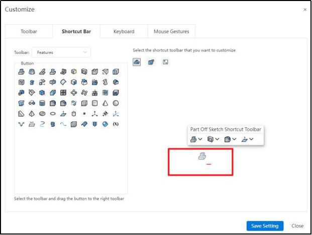
Delete button: Drag the tool from the shortcut bar outside the shortcut bar, and release the left mouse button after the "-" sign appears to complete the removal of the command button.
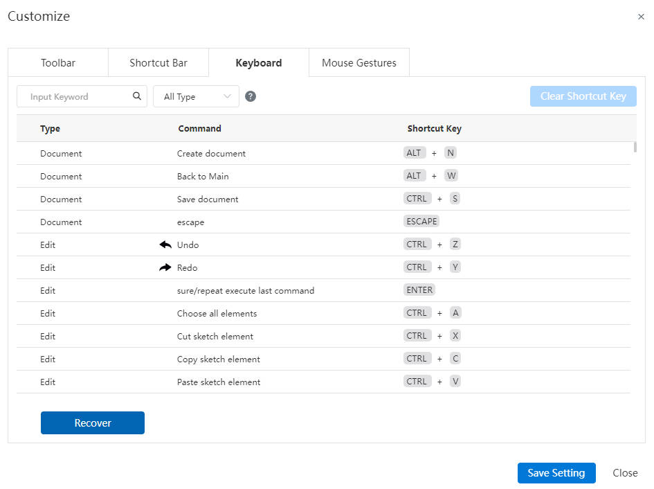
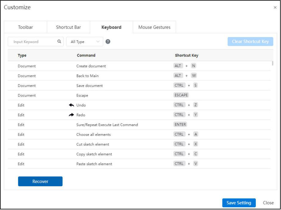
# Customize-Keyboard
- Shortcut Keys :View the system default shortcut keys, which support user customization. Enter the keyword to search the command, in the type drop-down box you can display the shortcut key by type.
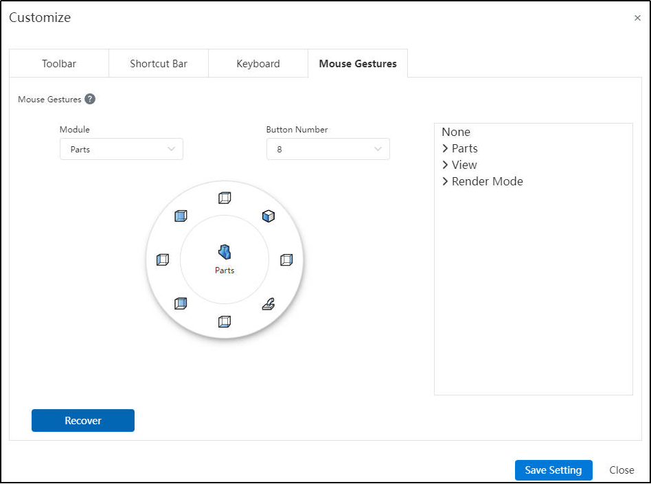
# Customize-Mouse Gestures
Buttons in the mouse gesture menu can be configured in the Part, Sketch, Assembly, Drawing, and Imported Drawing environments. There are two configuration methods:
Method 1: Select the button to be modified on the left and click the required command on the right.
Method 2: Find the desired command on the right and drag it to the button on the left to modify.
The number of commands that can be placed can be modified in the Number of Buttons drop-down menu.
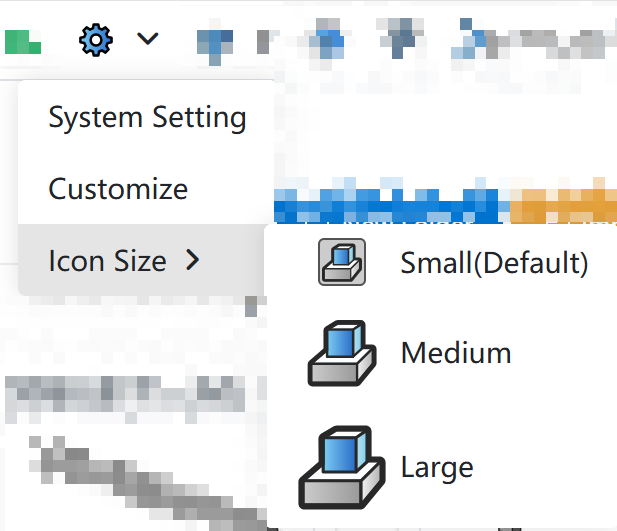
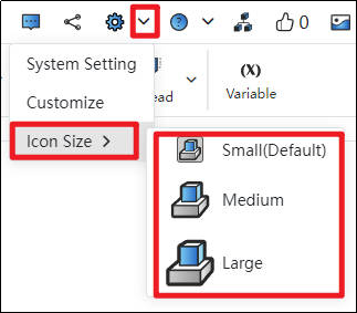
# Customize-Icon Size
Supports changing the icon size, which can be modified through the "System Settings drop-down box".
# Help
Click the help  icon in the upper right corner of the project interface, and a drop-down box will pop up as shown below:

# Guide Tutorial
Click "Guide Tutorials" to take users to the CrownCAD tutorial screen. The CrownCAD tutorial provides videos and text instructions to help users quickly and intuitively grasp the CrownCAD functions and application skills.
# User Manual
Click on "User Manual" to take users to the CrownCAD Help Manual screen.
# New User Guide
Click "New User Guide" to take the user to the animated guide screen.
# What’s New
Click “What’s New”, users can view the New Feature Handbook.
# Toggle Theme Style
Quickly switch theme style:Click the icon in the upper right corner
 of the project interface to quickly switch the theme style to "bright theme"
 or "dark theme"
 .
.To switch more theme styles:Click the setting icon in the upper right corner
of the project interface, and click the "Color" column to switch more theme styles.
# Full screen/Exit Full screen
Click the full-screen icon in the upper right corner of the project interface to display the interface in full screen, and the icon will correspondingly change to exit full screen
 ;The execution effect is the same as the effect of pressing "F11" in the browser, even if the browser is full-screen or exit full-screen.
# User Settings
Click on the personal account icon in the upper right corner of the project interface to pop up a drop-down box as shown below:
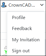
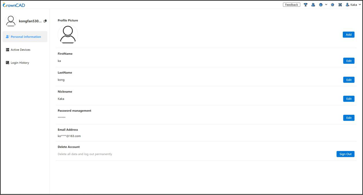
# Profile
- Personal information: Modify the profile picture, FirstName,LastName,Nickname, third-party login and other personal information.
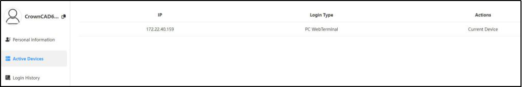
Active Devices: Devices that can view and process the account's current online presence.
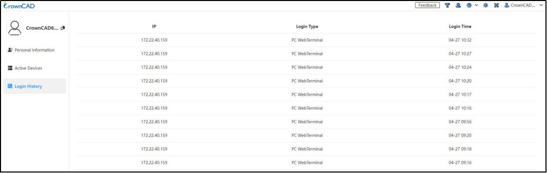
Login History: You can view the login operation records of the last 3 months.
# Feedback
- Enter the problem feedback interface, you can put forward suggestions in this position, we will contact you in time.
- A module must be selected before submitting feedback.
# Sign Out
Log out of your current account and return to the CrownCAD login screen.
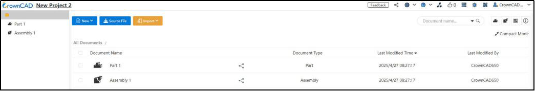
# Create Menu
The Create menu includes New project, New folder, Import, Task.
# New project
Create a new project in the current My project  . You can select the project type as public or private, and customize the project name.
- Check "Create part, assemble empty document" :
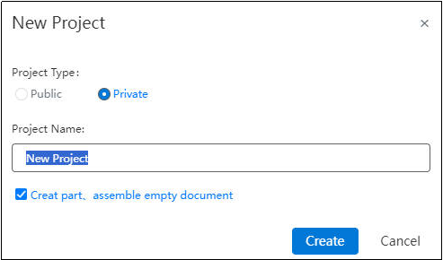
Click to enter the newly created project, the empty document of parts and assembly has been automatically created.
- Uncheck "Create parts, assemble empty documents" :
The new project created is a blank project and does not automatically create any files.
Note: In System Option > General, you can enable the restriction on creating public projects to prevent accidental creation, which could lead to data leakage.
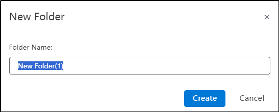
# New folder
Create a new folder in the current folder.
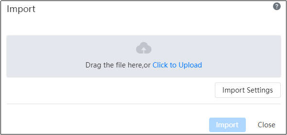
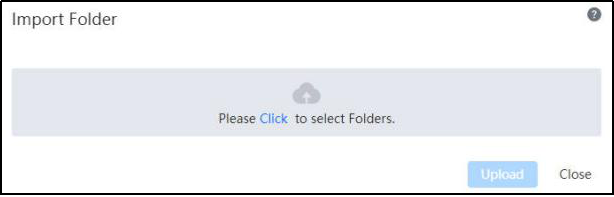
# Import
- Import file :Import models (parts or assemblies) in multiple formats into my project. The location of the imported document is automatically a project. See Data Conversion for details.
- Import Folder :Import all files under the folder. The location of the imported folder is automatically a project. See Folder Import for details.
# List Details
List Detailsinclude Select All, Tag, Search, Put in Recycle Bin, details, List display. The details vary according to the options in the left menu bar. See below for details.
# List of items
When the corresponding menu bar option is selected, the items created under that option are displayed.
# Type of project
Project types include My Project, Shared With Me, Public,Team, Activity, Trash.
Refer to the related introduction below for details.
# My Project
# Recent Documents
Displays the most recently opened documents in this type of project. Click to open the document directly.
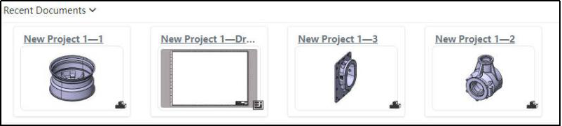
You can filter a specific type of document by document type in the upper right corner:

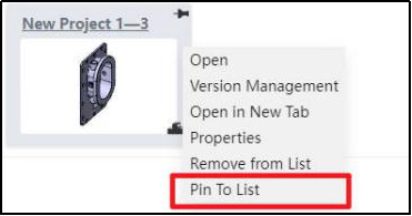
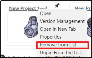
Fixed: The document is fixed and placed at the top of the recently opened list and will not be automatically removed.
When pointing to a document in the recently opened list, a thumbtack icon appears: Click Pin to list, then click Unpin again.

You can also do the pin/Unpin operation by right-clicking the menu.
Remove: Removes the document from the recently opened list without affecting the original document.
# Open/Select
Open: Click the folder or project name or thumbnail, or right-click after selecting and select "Open".
Select: Click somewhere other than the folder or project name or thumbnail to select them, and hold down the Ctrl key to select multiple folders or projects at the same time.
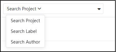
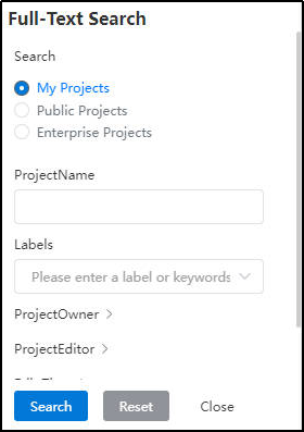
# Search
Search for items in My projects or search for tags.
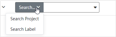
Select "Search Project" or "Search Label," which defaults to "Search Project", and click on the subscript in the search box to toggle the search type.
Type in what you want to search for and click Enter.
Click the drop-down box to the right of the search box to set multiple search criteria.
# Delete
Store the folders or items you want to temporarily delete in the recycle bin.
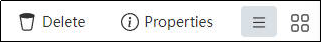
Left select the folder or item you want to put in the recycle bin, Ctrl to select more than one.
Click on the top right, or right click to complete the operation.
注意
Items or folders in the recycle bin can be "Restore" or "Delete", see Trash for details.
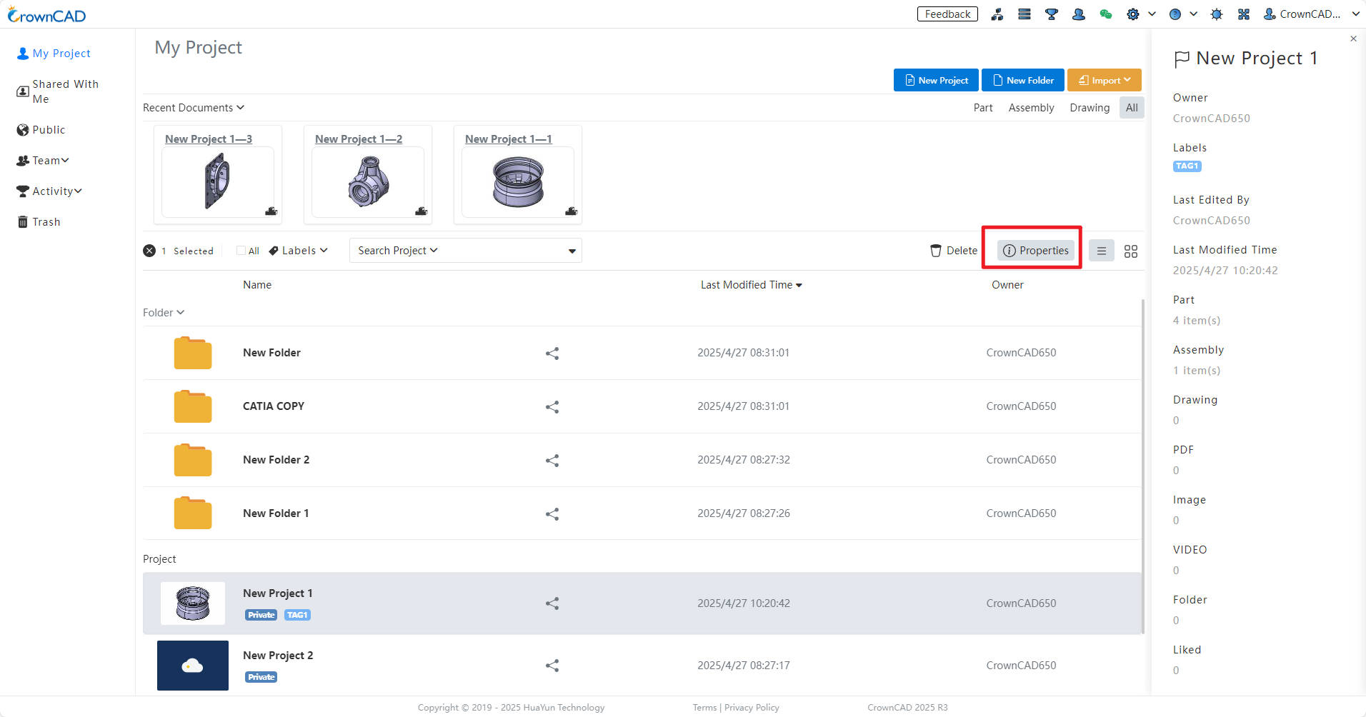
# Details Panel
The details panel displays the details of the project or folder, including the project/folder name, owner, label, last edited time, location (this item is valid for the project or folder in the folder), likes, copies. The Details panel is turned off by default.
- After selecting an item, click
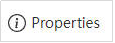 or right-click the menu to open the item's details panel, as shown in the image below.
- To close the Details panel, click again
 or × in the top right corner.
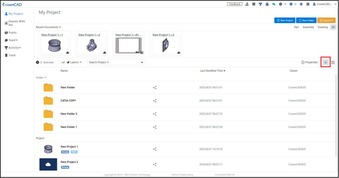
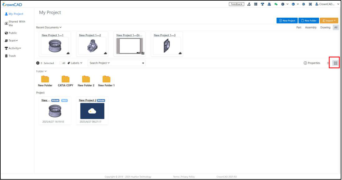
# List of Views
Project pages offer two types of view modes :
:
List view  (default) shows folders, projects, and their details, sorted by last edit by default. Click the name of the folder or project or double click to open the folder or project. Right-clicking will bring up a list of commands for the folder or project.
Tiling View displays folders and items by tiling their ICONS, as shown in the image below. Each icon includes the name of the project and the last edit time. Open the folder or project by clicking on the name, and select the folder or project by clicking elsewhere.
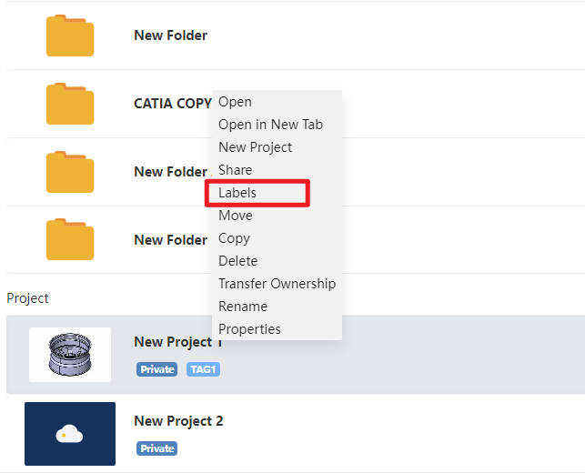
# Right-Click list
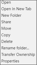
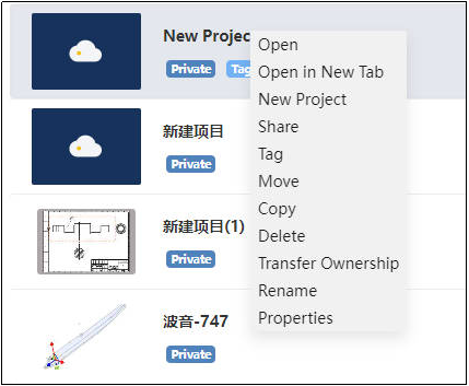
1)Select an item and the right-click menu appears as follows:
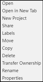
Open - Open the document in a new TAB.
Open in a New TAB - Generate a new TAB and open the selected item.
New Project – Create a new project.
Share - Share your own folder or project with other users and assign permissions to each user. See Share for details.
Labels - Select the label you want to apply to the selected document.
Move -- Moves the selected document to a folder.
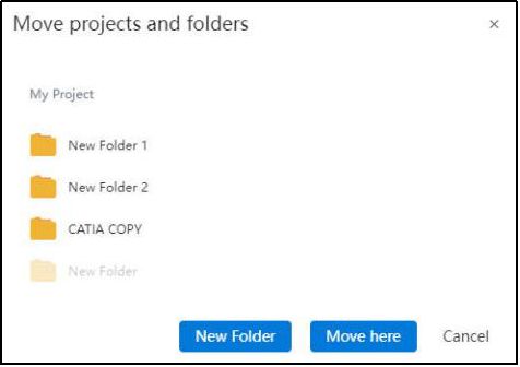
Copy - Creates a copy of the selected item. The new copy name is called "xx (01...) "And the copy is in the same folder as the item being copied.
Delete – Moves the currently selected single or multiple projects or folders to the Recycle Bin.
Transfer Ownership – Changes the owner of the project.
Rename – Assigns a new name to the project or folder.
Details: Toggles the Details Panel. When the Details Panel is closed, it opens the panel; when it is open, it closes the panel. For more information, refer to Details Panel.
2)Select a folder and right-click to display the following:
Same as above for specific functions.
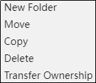
3)Ctrl to select multiple documents or folders and right-click to display the following:
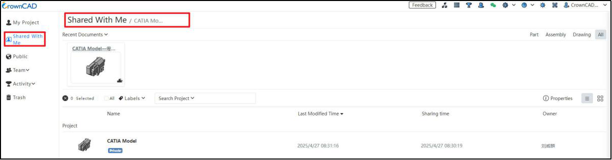
# Shared with Me
Users can view and edit items or folders that other users have shared with them. See Sharing Collaboration for detailed instructions.
# Recent Documents
Same as Recent Documents.
# Open/Selected
Open: Click the folder or project name or thumbnail, or right-click after selecting and select "Open".
Selected: Click somewhere other than the folder or project name or thumbnail to select them, and hold down the Ctrl key to select multiple folders or projects at the same time.
# Details
Same as Details panel.
# List of Views
Same as List of Views.
# Right-click list
1)Select an item and right-click to display the following:

2)Select a folder and right-click to display the following:

# Public
Users can open all public items and view or copy the items.
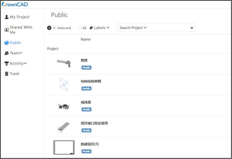
Note
Public items only show items, not folders.
# Recent Documents
Same as Recent Documents.
# Open/Selected
Open
Click the folder or project name or thumbnail, or right-click after selecting and select "Open".
Selected
Click on folders or projects beyond their name or thumbnail to select them, and hold down the Ctrl key to select multiple folders or projects at the same time.
# Search
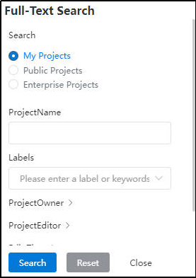
Search for items, tags, authors or specify multiple search criteria to search in public items.
# Details
Same as Details panel.
# List of views
Same as List of Views.
# Right-click list
1)Right-click on a blank area of an item to display the following:
Open: The document is displayed in "read-only mode", and the user can only view the model, not edit it.
Open in New Tab**😗* A new browse TAB opens the document and displays it in "read-only mode".
New Project – Create a new project
Copy: Copy the public item to "My Project" and the document will be editable.
Properties: same as Details panel.
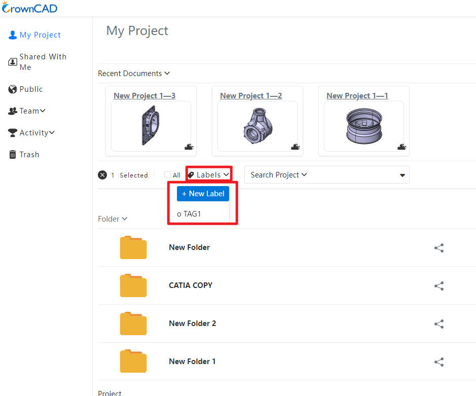
# Labels
Create a new label and display all the labels that are currently created.
- Click on a specific label to display the items under that label.
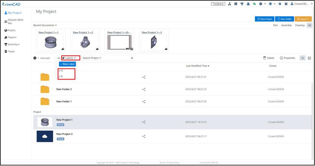
- Right-click a label to delete the label.
Click  to add a new label.

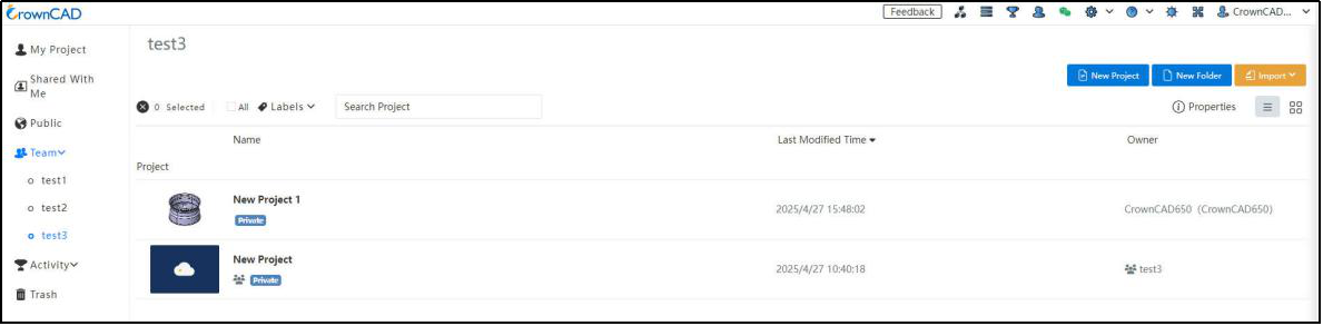
# Team
Show the team that has been created by clicking on the specific team name to show the documents that have been shared for that team and the documents that have been created.
# Activity
Show the items that the event participants have shared to the event, viewable only.
# Trash
Store items and folders that users temporarily delete.
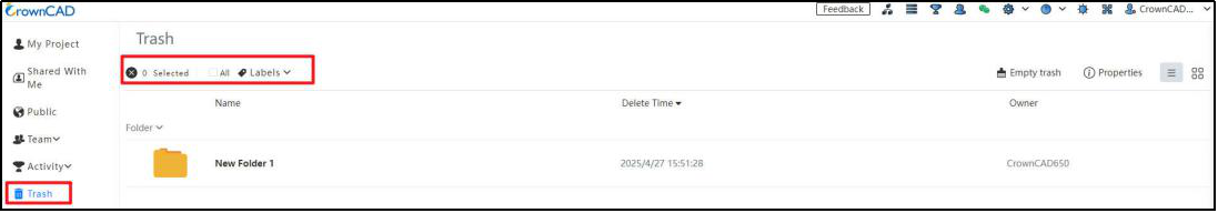
(1)Empty trash: You can delete all items and folders in the recycle bin. This operation cannot be undone and cannot be restored after deletion.
(2)Restore: Restore the selected items to where they were before. Select the item and click  or right mouse click to select "Restore".
(3)Delete: Deletes the selected item and cannot be restored. Select the item and click  or right mouse click to select "Delete".
